← INDEX/09 OF 092021
Morpa Ders
Matching wasn't the product, learning was.
Morpa Ders started as a tutor marketplace and research turned it into a structured learning product. We benchmarked six competitors, mined their reviews, and shipped group classes, recorded lessons, and a review system that protects both students and tutors.
- Role /
- Product Designer
- Team /
- Art director, product, engineering
- Timeline /
- 2021
- Platform /
- Web
- Tools /
- Figma, Miro
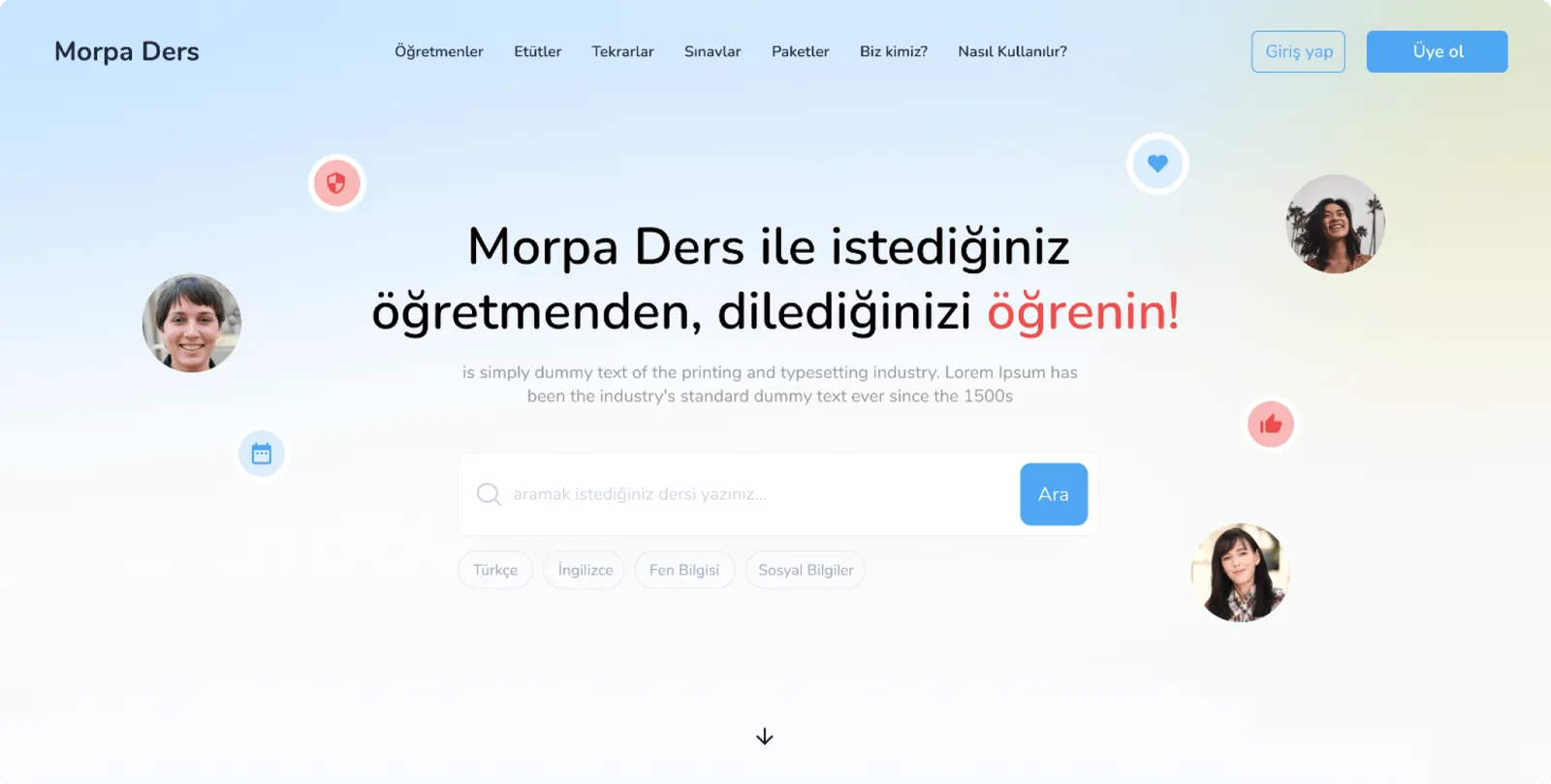
01 // Morpa Ders: from matching to learning
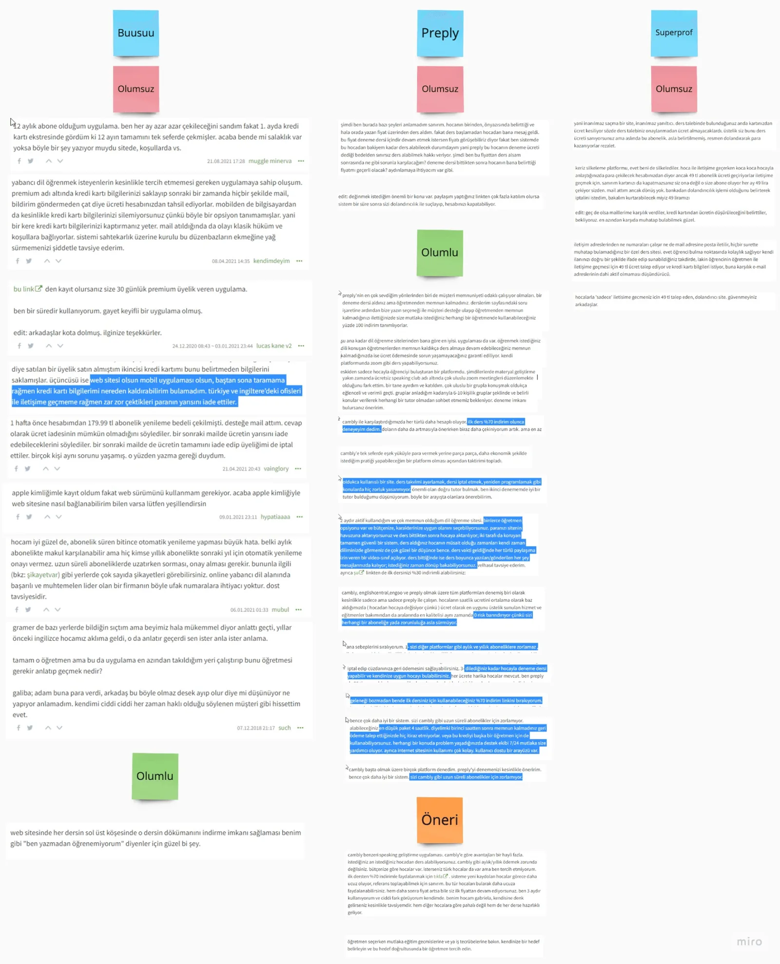
Morpa Ders started with a simple goal: connect students with private tutors. Research changed that. We benchmarked Preply, Superprof, italki, Busuu Live, Udemy and Lesson Face, and read through user reviews of the closest ones, sorted into praise, complaints and suggestions. What came back was that matching alone isn't a product. Families needed a way in that private-lesson pricing didn't give them, students needed more than one way to learn, and tutors needed more than one way to earn.
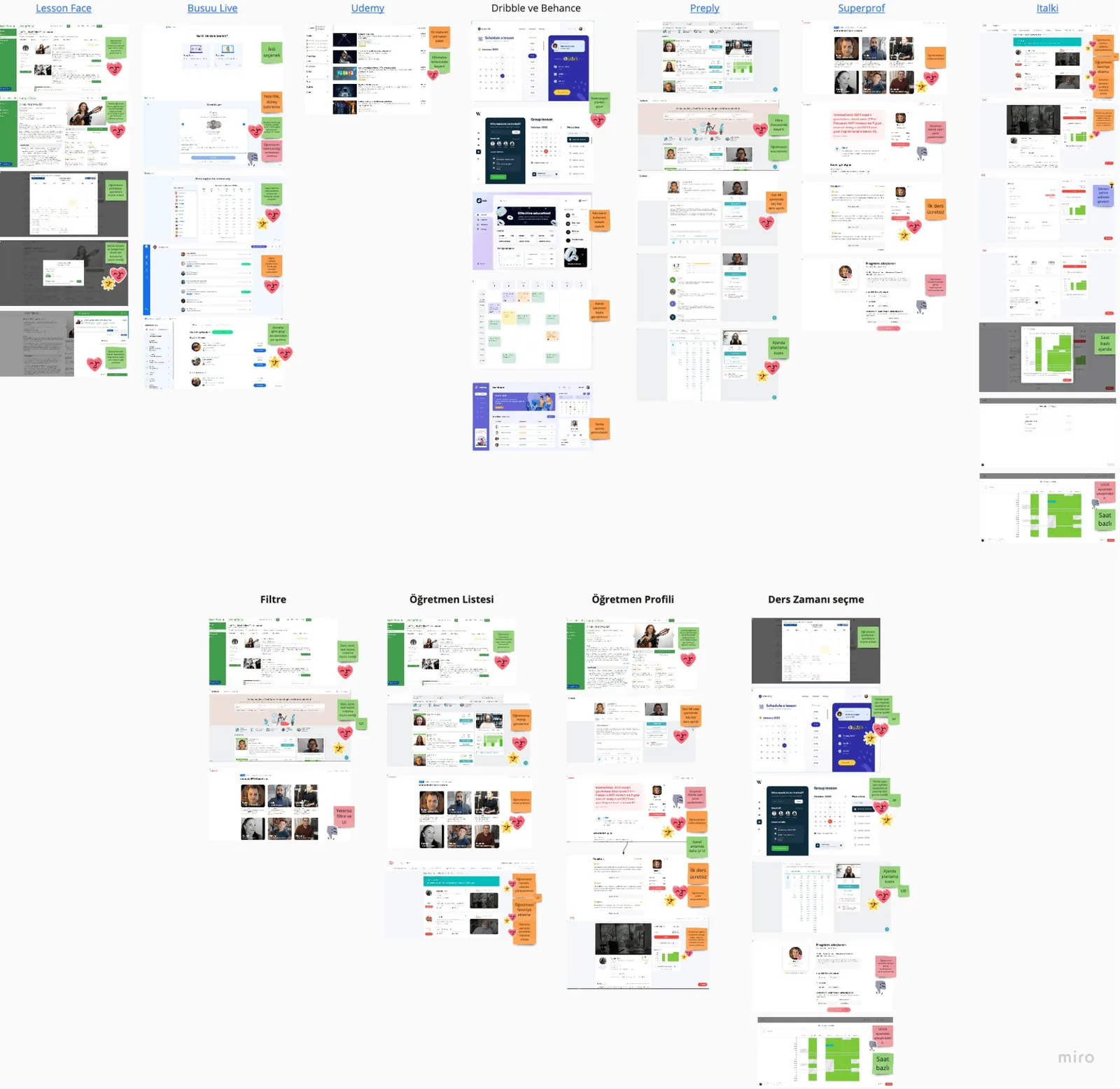
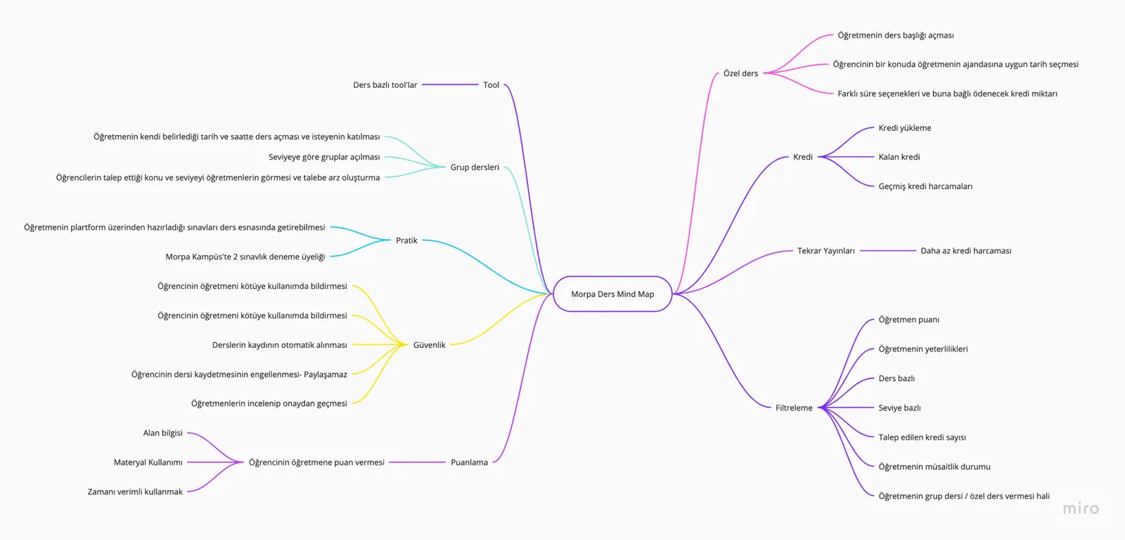
So the marketplace became structured learning:
- 01Group classes, so families who can't afford private lessons still have a way in, and students who prefer learning in a group get one.
- 02Recorded lessons that tutors publish and sell. Not live, not interactive, still paid, so a tutor reaches more students and earns beyond their calendar.
- 03Ratings and reviews after every class, to help students choose well and tutors improve.
- 04A calendar of each tutor's availability with booking for specific times, and a list of planned group lessons where a student can take a seat in a couple of taps.
02 // The harmful-comment flag
PROBLEM /
Ratings cut both ways. A teacher who works for Morpa pointed out during research that a student might leave a negative review for reasons that have nothing to do with the lesson: they know the tutor from school, and simply don't like them.
CONSTRAINT /
Reviews had to stay. Students choosing a tutor need them, and tutors need the feedback. Removing ratings would have protected tutors by making the platform worse for everyone.
DECISION /
Let tutors mark a comment as harmful and explain why they think so. Morpa reviews the flag and decides whether the comment stays. The tutor gets a voice; the platform keeps the final say.
OUTCOME /
A review system students can trust and tutors can live with, shaped by one conversation we would have missed without research.
03 // The screens
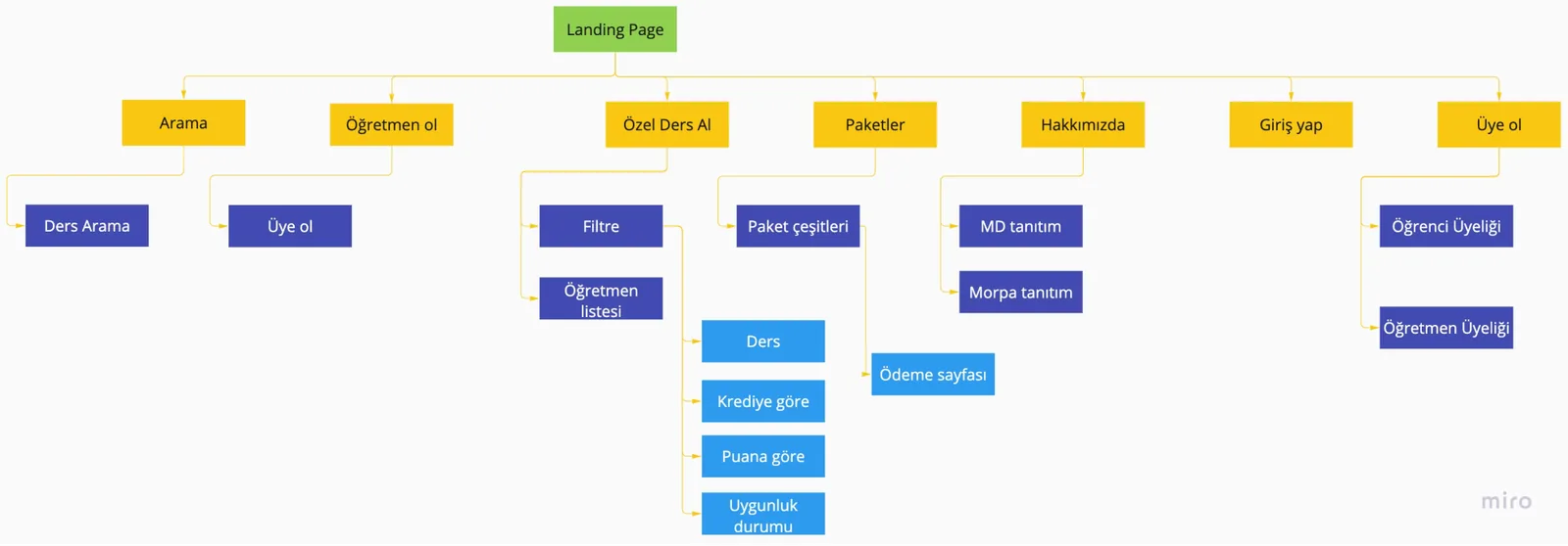
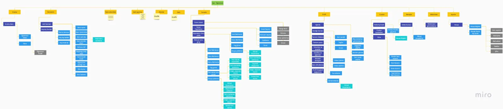
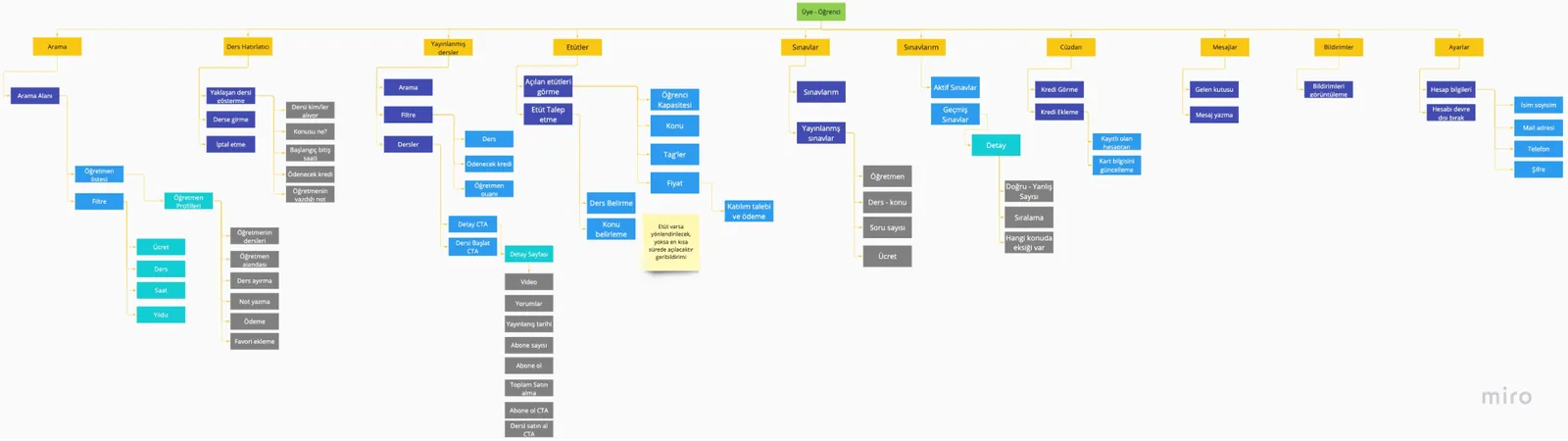
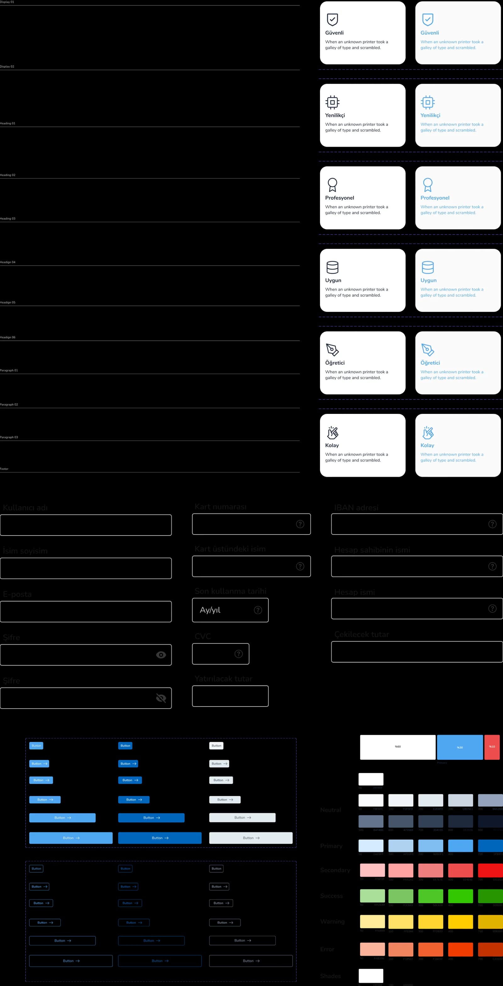
There were few direct references for a product like this at the time, so the wireframes came from the research and the maps rather than from anything we could point at. We reviewed them as a team, changed what didn't hold, and moved to UI: a style guide first, then the screens.
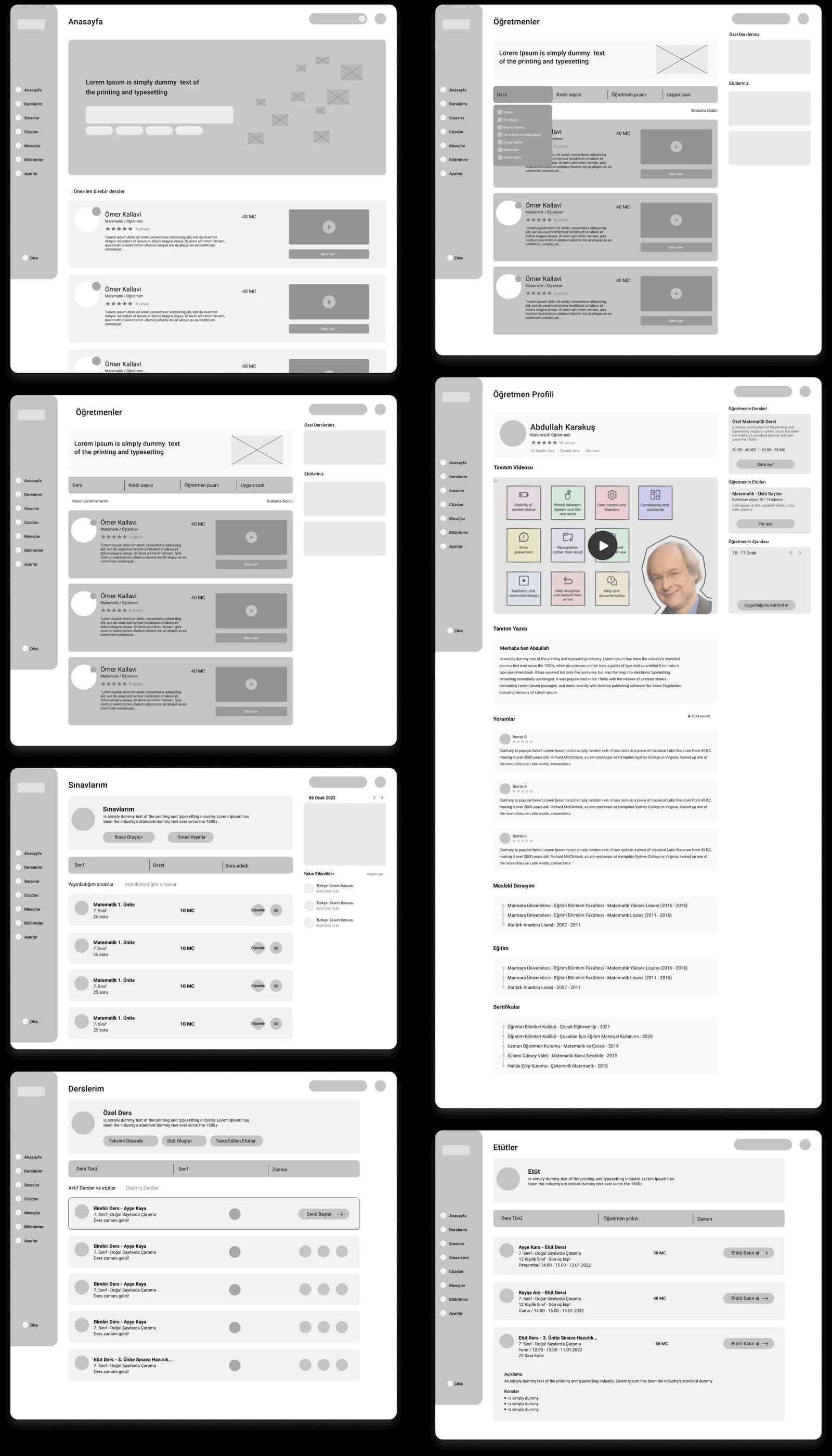
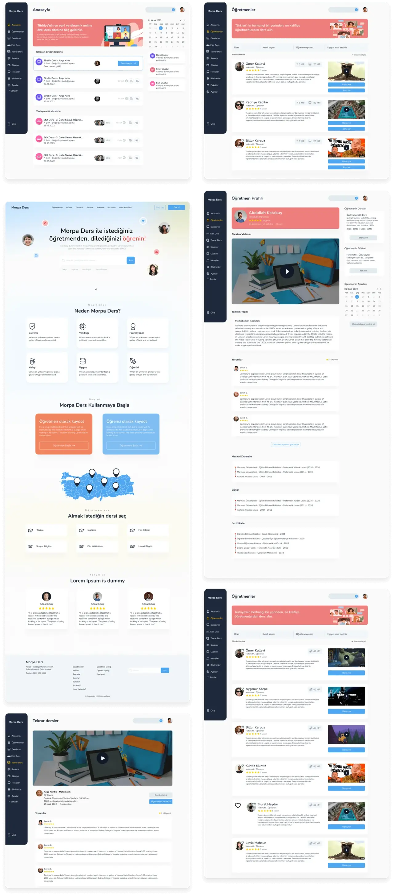
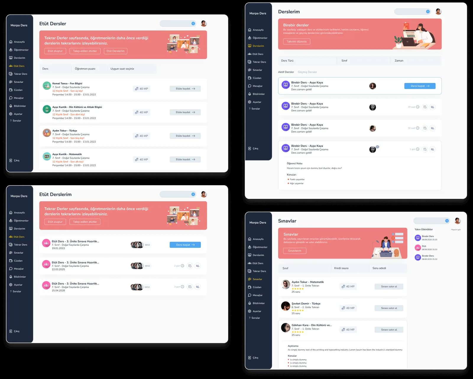
What I'd change now: the student sidebar carries eleven sections. A 12-year-old needs about five. I'd fold exams, replays and study sessions under lessons, and make the rest earn its place.