← INDEX/08 OF 092021
Morpa Kampüs
One interface, four audiences, ages 8 to 60.
Morpa Kampüs is one of Türkiye's largest school e-learning platforms, used by over a million people, and it shipped as four apps for students, teachers, parents and administrators that share one interface. The hard constraint was age: 14-year-olds refuse anything that looks made for 8-year-olds.
- Role /
- Product Designer
- Team /
- Art director, product, engineering
- Timeline /
- 2021
- Platform /
- Mobile apps
- Tools /
- Figma, Miro
01 // Four apps, one interface
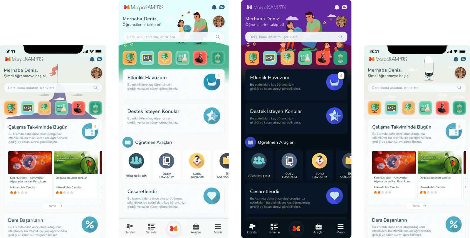
Morpa Kampüs is an e-learning platform for primary and middle school students, used by schools and families across Türkiye. We shipped it as four applications: one for students, one for teachers to follow their students' assignments, one for parents to see how their children are doing, and one for school administrators to follow both. Four apps, many personas, and one decision that shaped everything: they would share a single interface, with only limited differences between them.
- 1M+
- active users
- 4
- apps on one interface
- 8 – 60
- ages of the people using it
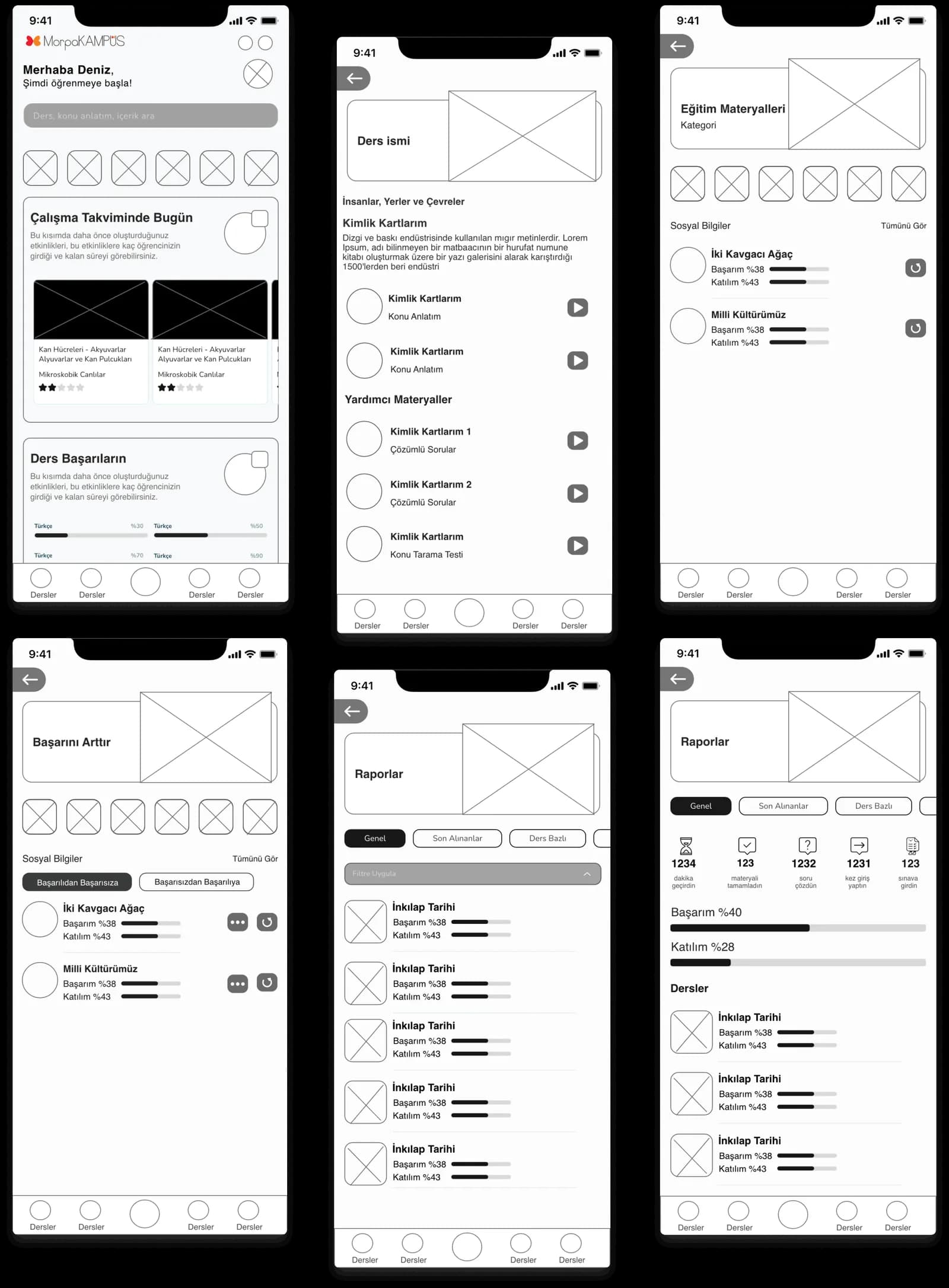
Sharing an interface between an eight-year-old and a sixty-year-old school manager sounds like a compromise. It's the opposite. A parent who learns the student app's structure can read the parent app without learning anything again. A teacher moving between their own app and a student's screen sees the same shapes. The work ran through wireframes and brainstorm sessions with my art director, then design, iteration, testing, and iteration again until the shared structure held for all four.
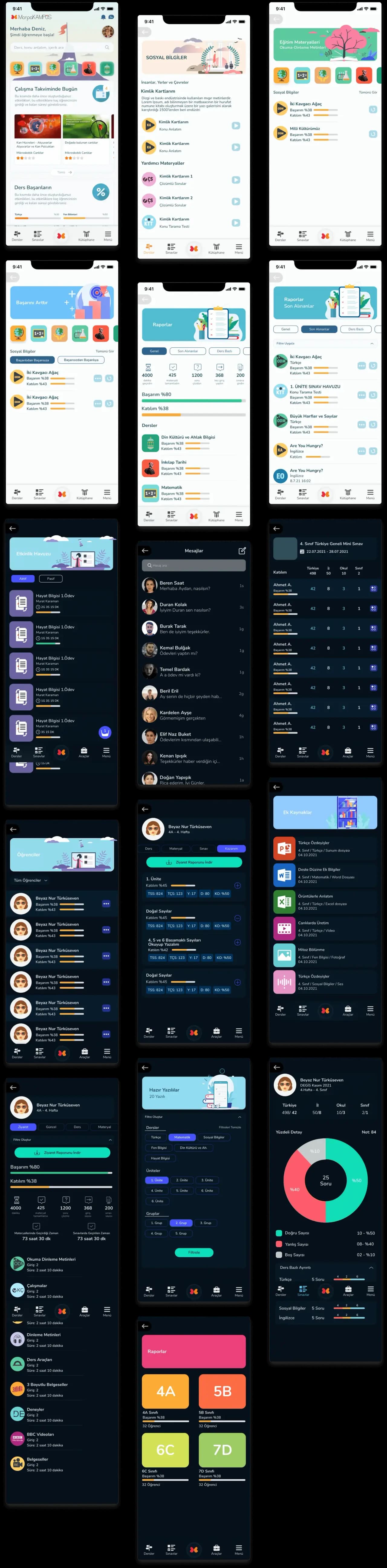
Two deliberate differences survived. The teacher, parent and manager apps run in a dark theme, so the adult tools look like tools. And the student app changes its illustration register by age.
02 // The age problem
A student can be anywhere from the start of primary school to the end of middle school, and a 14-year-old will reject anything that looks made for a child. So the student app keeps one colour system and one layout for everyone, and varies only the illustrations: playful for primary school, noticeably more mature on the first screen for middle school. Same product, different tone of voice. It's the cheapest way I know to respect a teenager.