← INDEX/04 OF 092025
VOLGEN
Research to live in three days.
An AI video production studio needed a site. I used NotebookLM for the competitor analysis and the information architecture, then built it in Antigravity with Gemini 3 Pro and Claude Opus 4.5: Next.js, bilingual Turkish and English, with a CRM pipeline behind it. Research to live in three days.
- Role /
- Designed & built, solo
- Timeline /
- 3 days, research to live
- Platform /
- Web — Next.js + React, TR/EN
- Tools /
- NotebookLM · Antigravity (Gemini 3 Pro, Claude Opus 4.5)
01 // The brief
VOLGEN is an AI video production studio. It takes an idea, a word, a feeling, and turns it into cinematic scenes, digital characters and campaigns, bringing in traditional production where that adds something. It needed a site that said this plainly, showed the work, and turned an enquiry into a lead without anyone copying it out of an inbox. Quickly.
- 3
- days, research to live
- 15
- pieces in the works grid
- 10
- physics pills you can throw around
On top of the client's brief I set myself one: the site had to look modern and be fun to surf, and still put the work first. Every design decision below is evidence for that line.
The constraint was time, and the bet was that time on a site like this mostly goes to the wrong things: re-reading competitor sites, arguing about section order, hand-writing boilerplate. Models are good at exactly those. So the plan was to hand the mechanical work to AI and keep every decision.
02 // Day one: research in NotebookLM
I loaded the competitor material into NotebookLM and used it as a reading partner, not an oracle. What does every studio site say? What does none of them say? Where does the work sit, relative to the pitch? NotebookLM answers questions against a fixed set of sources and has no opinions of its own, which is the right division of labour for research.
What came out was the information architecture: Home, About, Services, Work, Contact. Five items, because a studio site is a portfolio with a phone number attached — and only two of them are routes; Services, Work and Contact live as anchors on one long home page. Which of the five carries the weight, and in what order, was my call, not the model's.
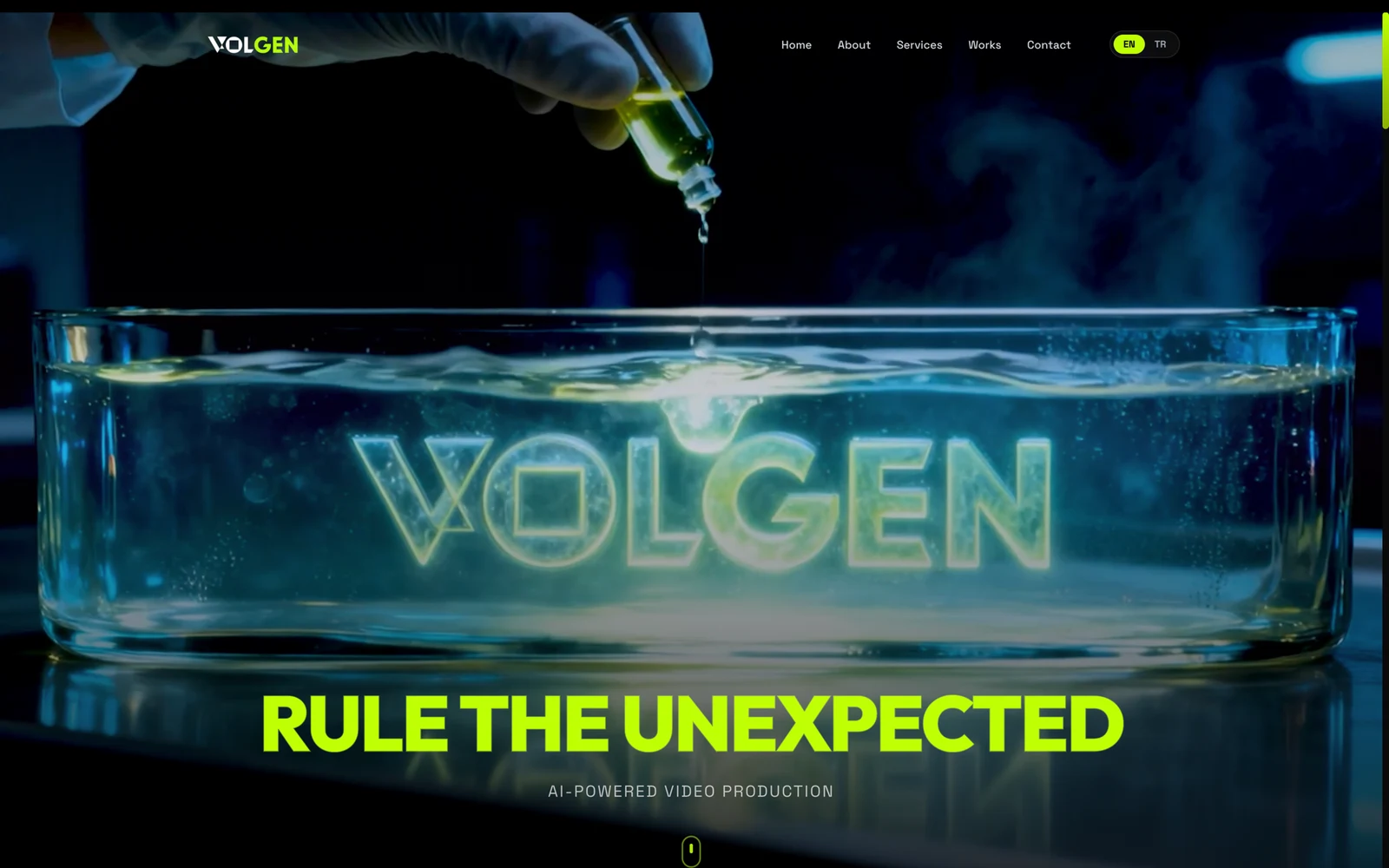
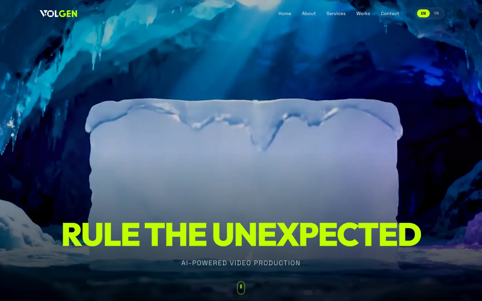
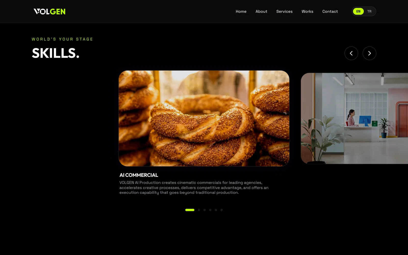
The hero leads with the showcase video, because on an AI video studio's site the reel is the product; everything else on the page is there to support it.
PROBLEM /
A studio site that opens with a pitch makes you scroll to find the proof, and the slogan and the logo compete for the same first glance.
DECISION /
The showreel first, full-bleed. The slogan — Rule the unexpected — is positioned specifically below where the VOLGEN logo lands in the video.
OUTCOME /
The logo appears through the video in different places, patterns and textures, and the slogan sits under it, so the two always read together. It's the page's best detail, and the first thing you see.
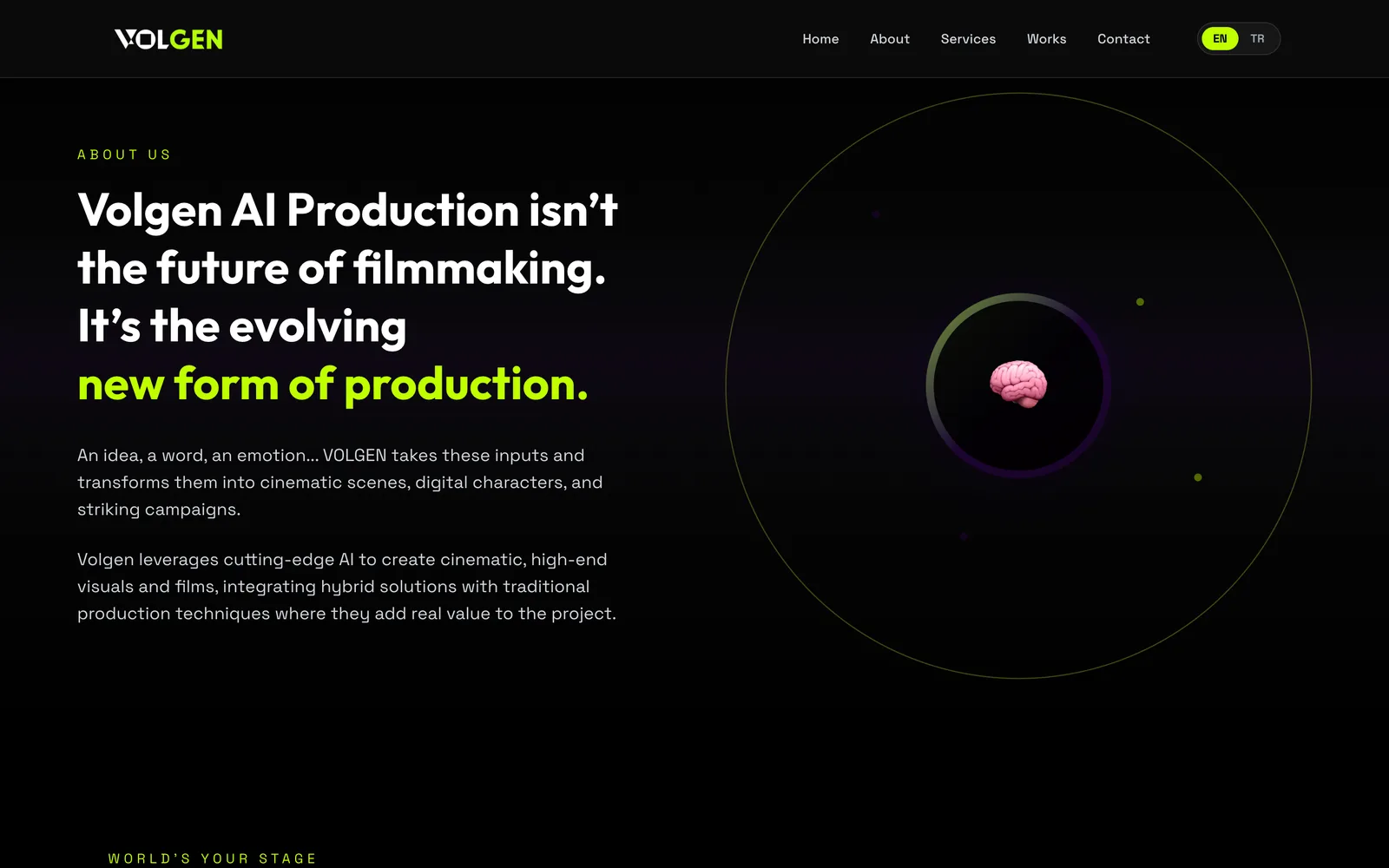
Under it, the what-we-do section says one thing: we create with AI, but we decide. It says it with a brain at the centre of orbiting circles. Looking back, a stronger element could have carried that idea. It does the job.
03 // Day two: the build in Antigravity
Next.js, built in Antigravity with Gemini 3 Pro and Claude Opus 4.5. The split was simple. The agents wrote most of the code. I decided what the code should do: the component boundaries, and what happens when someone sends an enquiry.
That last one matters more than it sounds. A studio site's only job, after looking good, is to turn interest into a conversation. So enquiries feed a CRM pipeline behind the site — set up in the same three days as the pages around it — with the content managed through a login-gated CMS rather than redeploys. When someone writes in, the form posts to the site's own backend: the enquiry lands as a lead in the admin and the studio gets a notification email, so nothing sits in an inbox waiting to be copied out.
PROBLEM /
A studio site goes stale the week the agency can't change it without the person who built it.
DECISION /
A login-gated admin where the agency edits any text and any project's details, and adds new works — in Turkish and English — without me.
OUTCOME /
Content is theirs, not a redeploy. The leads live in the same place, so the admin is the CRM and the CMS at once.
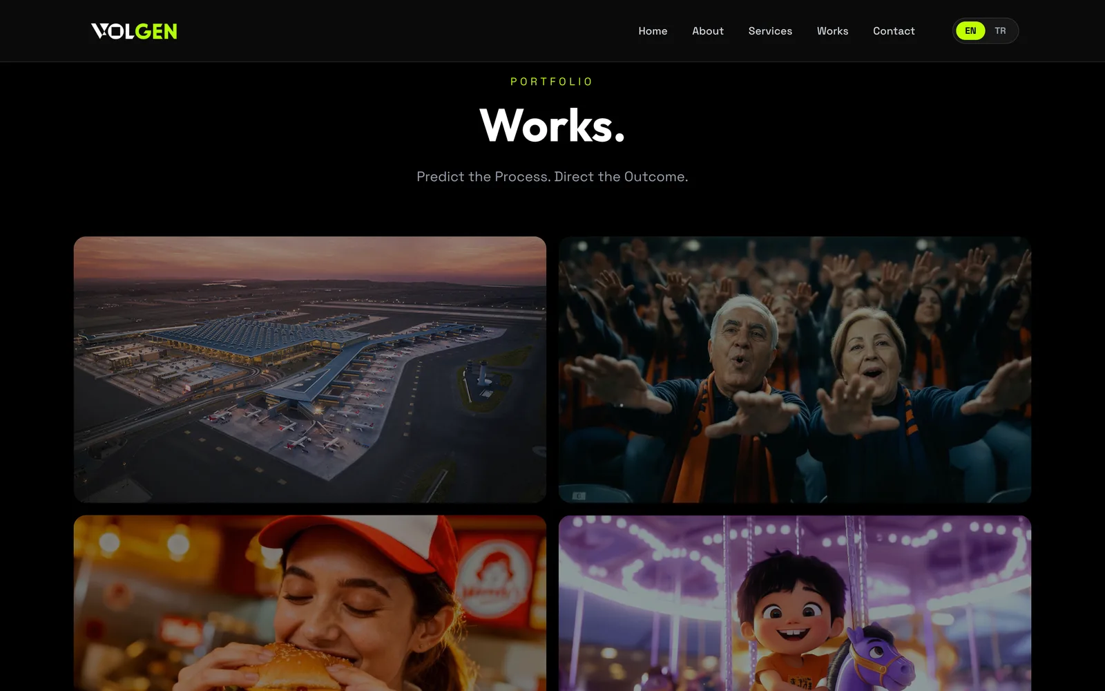
The works grid mixes vertical and horizontal pieces on purpose: each one keeps the orientation of the format it was made for, so the format communicates itself without a label. Fifteen pieces — twelve landscape, three vertical.
04 // Day three: the human parts
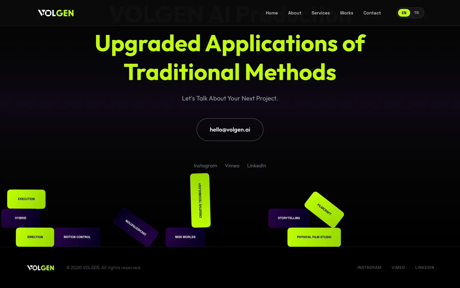
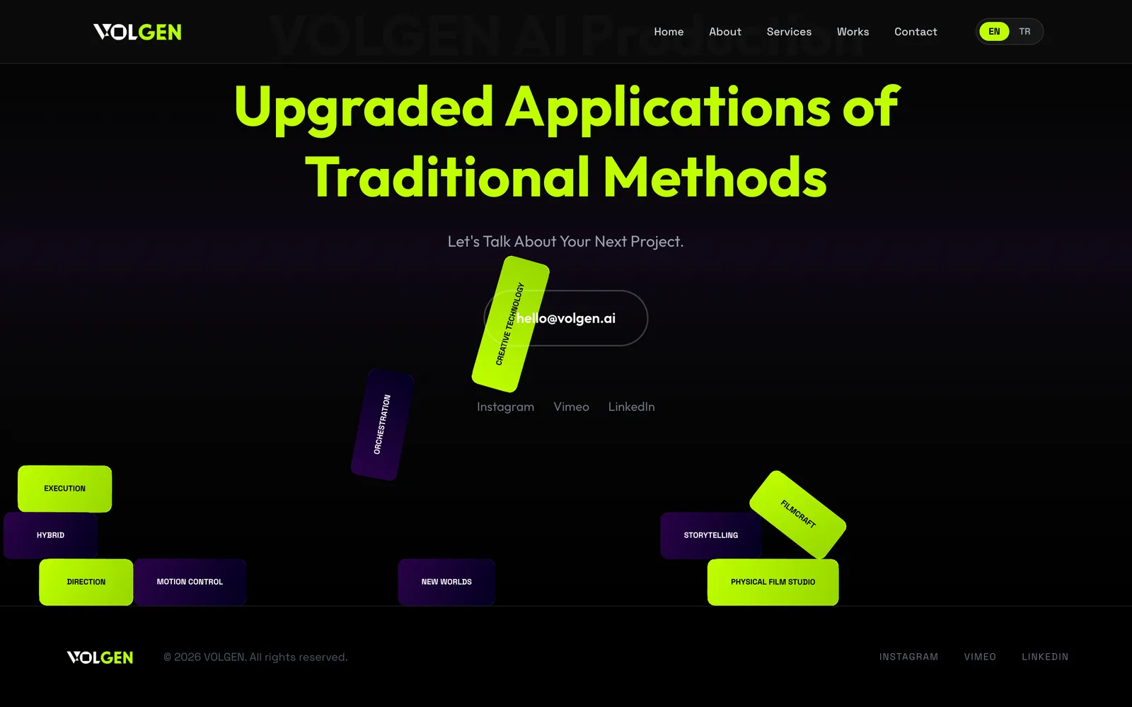
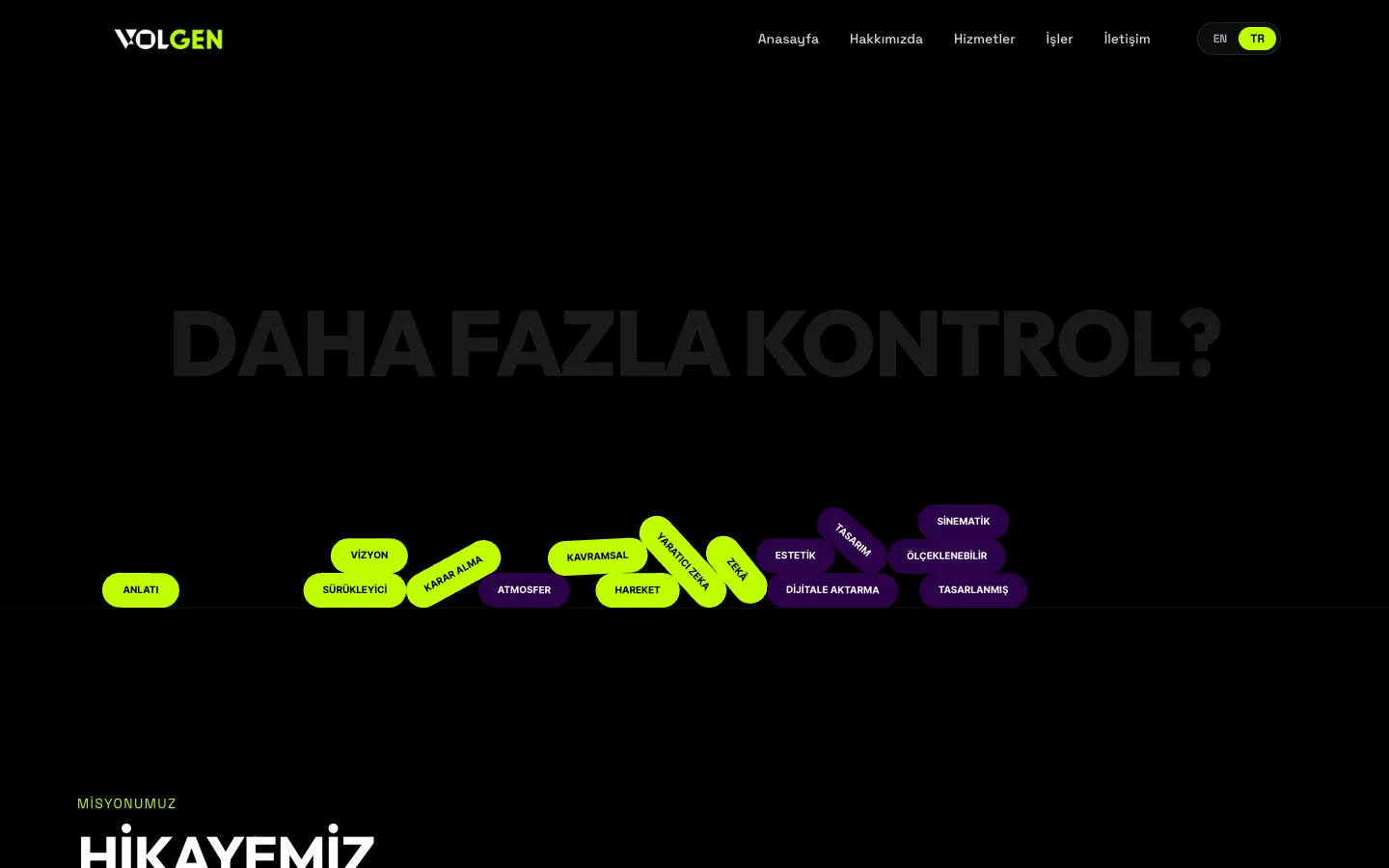
With the structure standing, the last day went on the things a template never has. At the bottom of the home page, ten labelled pills — the studio's key capabilities: HYBRID, FILMCRAFT, MOTION CONTROL, STORYTELLING and six more — drop into the contact section under a rigid-body physics simulation. They fall, collide, and stack against an invisible floor; every load settles into a different pile. You can grab one and drag it, knock the others around, or flick it and launch it like a rocket. Labels nobody reads, made into something people play with. It renders on desktop only — on a phone there is no room to play, so it simply isn't there.
The About page header gets the same idea with a different mechanic: chips fall from above, and hovering one pops it like popcorn. Same purpose — make people read the labels by making them fun to touch.
“Moving fast shouldn't mean losing the human parts.”
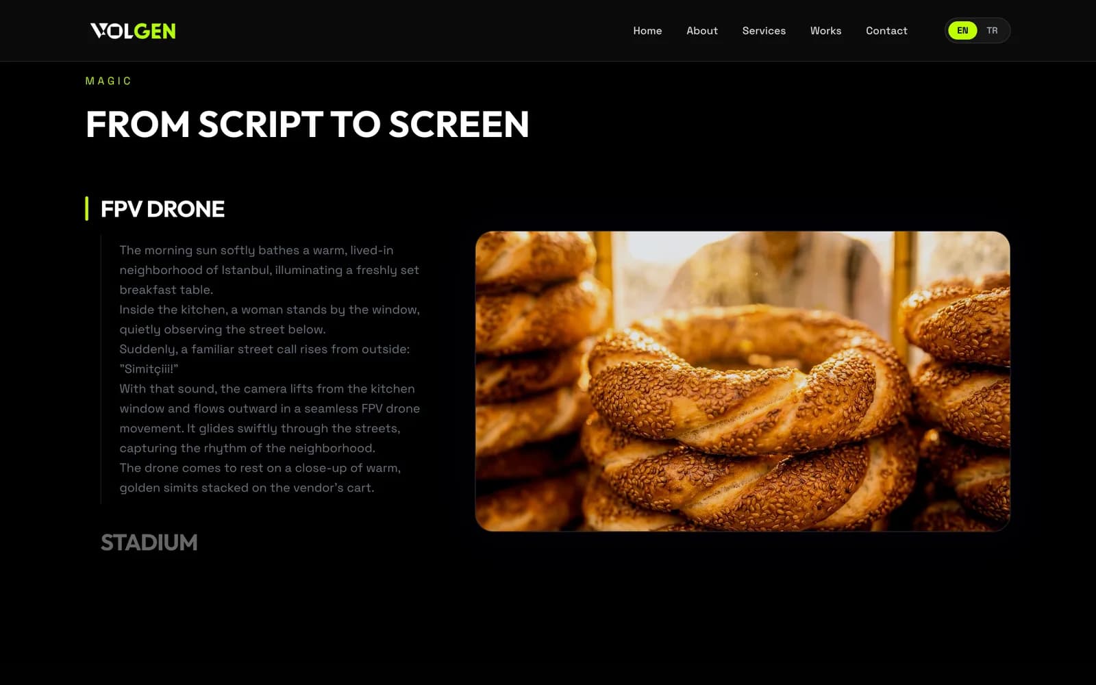
Those pills are the part I actually care about. They cost a few hours, and they're the difference between a site that was generated and a site that was made. Elsewhere: a script-to-screen section that shows two scripts exactly as written — a morning in an Istanbul neighbourhood, a stadium going quiet — and the works grid with its fifteen pieces.
Script to Screen is the trust pattern of this category. Direct and indirect competitors all show the prompt next to the result, because it proves the studio's control over the output — that the frame was directed, not found. So VOLGEN shows it too: the script on the left, unedited, and the frame it produced on the right.