← INDEX/05 OF 092023
Balkan Transfer
From form-filling to decision-making.
Airport transfer booking asks people to commit before they know if the trip is feasible. I led the redesign of the website and the mobile apps around one reframe: stop asking users to fill a form, start helping them resolve decisions. Shipped with reusable passenger profiles, transparent pricing and self-service booking management that took the small changes off the phone lines.
- Role /
- Lead Product Designer
- Team /
- Junior UX/UI, Head of Design, PM, Engineering, client stakeholders
- Timeline /
- 2023
- Platform /
- Public website + mobile apps
- Tools /
- Figma, FigJam, AI for synthesis
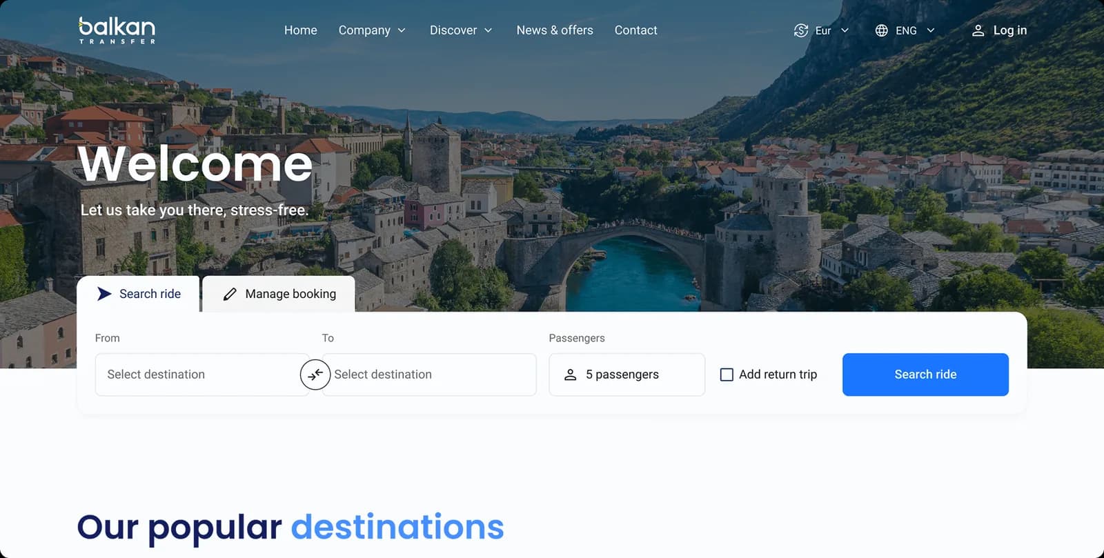
01 // The problem
Balkan Transfer runs airport transfers in Bosnia and Herzegovina. A booking has an outbound leg and often a return, a set of passengers, extras like luggage and child seats, and a price that depends on all of it. The result is a structured ticket the driver works from. Customers are one-time travellers and regulars, and both want the same three things: clarity, speed, and confidence at the moment they commit.
The old platform treated that as a form. Fill every field, submit, find out. But every decision that matters in a transfer booking is made under uncertainty. Is the route available? What does it cost with two bags and a child seat? Does the return time work? Users didn't find out until after they'd tried, so they hesitated, guessed, and tried again.
- 01No visibility of availability or feasibility until after submission
- 02Repeated data entry for frequent travellers
- 03No way to modify or cancel a booking without calling support
- 04No driver or vehicle details before the ride
- 05No post-booking management, so every small change went through customer service
02 // What we found
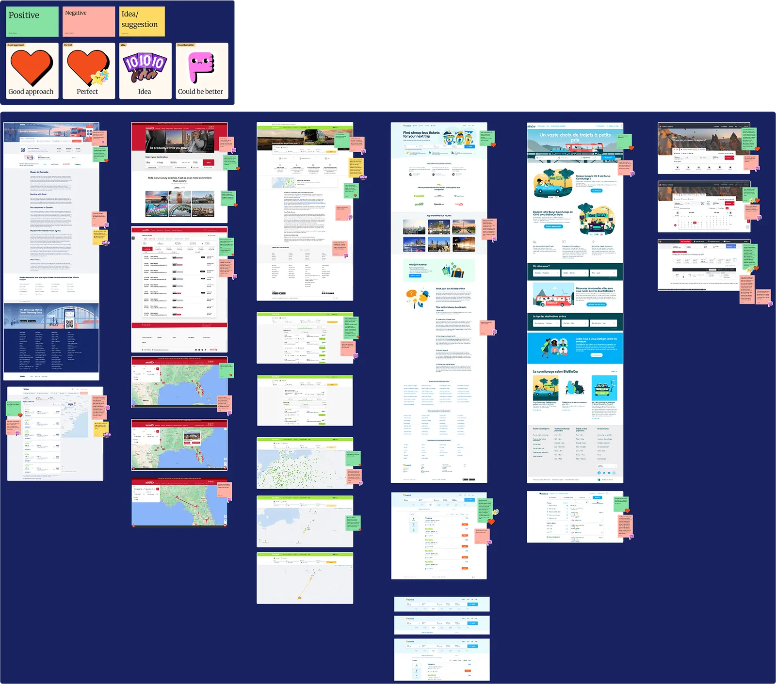
Across stakeholder sessions and competitor audits, three pain themes kept coming back.
- 01Low availability visibility: users only learned whether a trip was feasible after submitting the form.
- 02Heavy configuration effort: many fields and steps, with no shortcuts and nothing reused.
- 03Repeated input: frequent travellers typed the same passenger and extras details every single time.
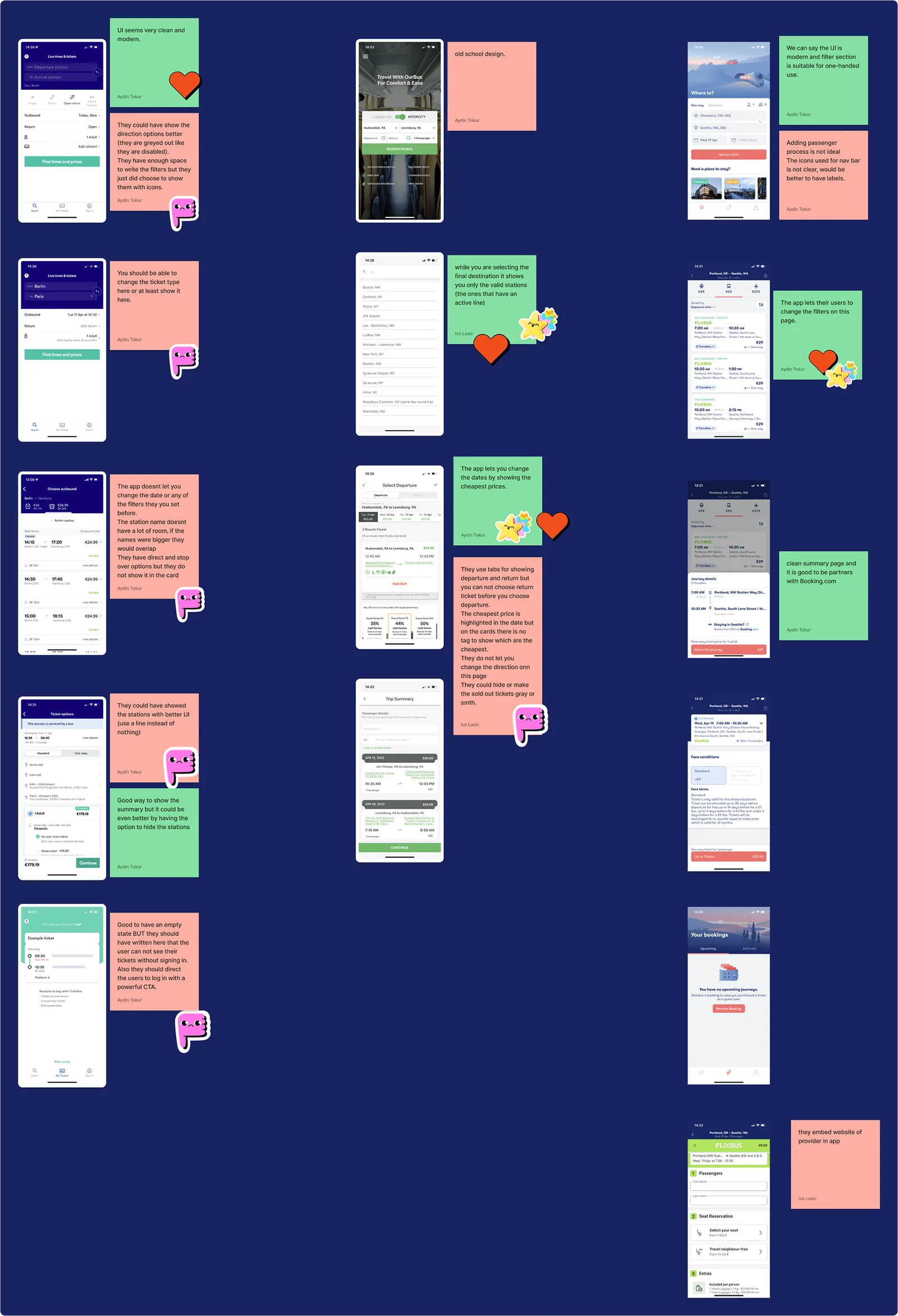
Underneath the three themes was one insight. Users think in terms of their trip, not in terms of fields. They expect the system to remember the people they travel with, keep the configuration small, and make feasibility and price clear before they commit.
03 // The reframe
PROBLEM /
The booking flow was a form. Users had to supply everything before the system told them anything, so the decisions that matter, route, price, passengers, return timing, were made blind.
CONSTRAINT /
The business logic was real. Prices depend on route, passengers and extras, and drivers need a complete, structured ticket. We couldn't ask for less information. We could only change when we asked for it, and what we gave back.
DECISION /
Reframe the experience from “fill forms, submit” to “resolve decisions, commit”. Surface feasibility and price early. Structure the decisions as a logical sequence. Reuse what the user has already told us instead of asking again. And extend the product past checkout, so a change after booking doesn't need a phone call.
OUTCOME /
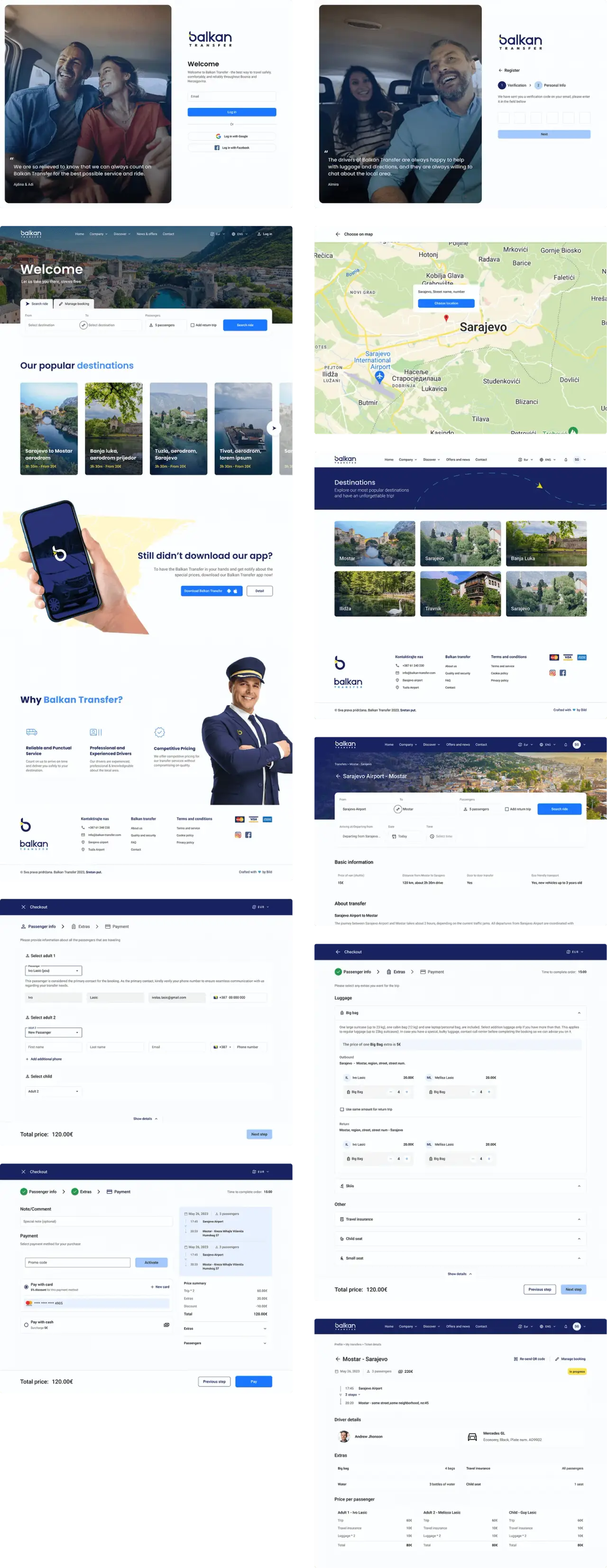
One flow for web and mobile: search a ride, pick a time with the price beside it, confirm passengers from saved profiles, add extras, pay. Then a My booking area to see the driver and vehicle, edit, or cancel.

04 // Designing the flow
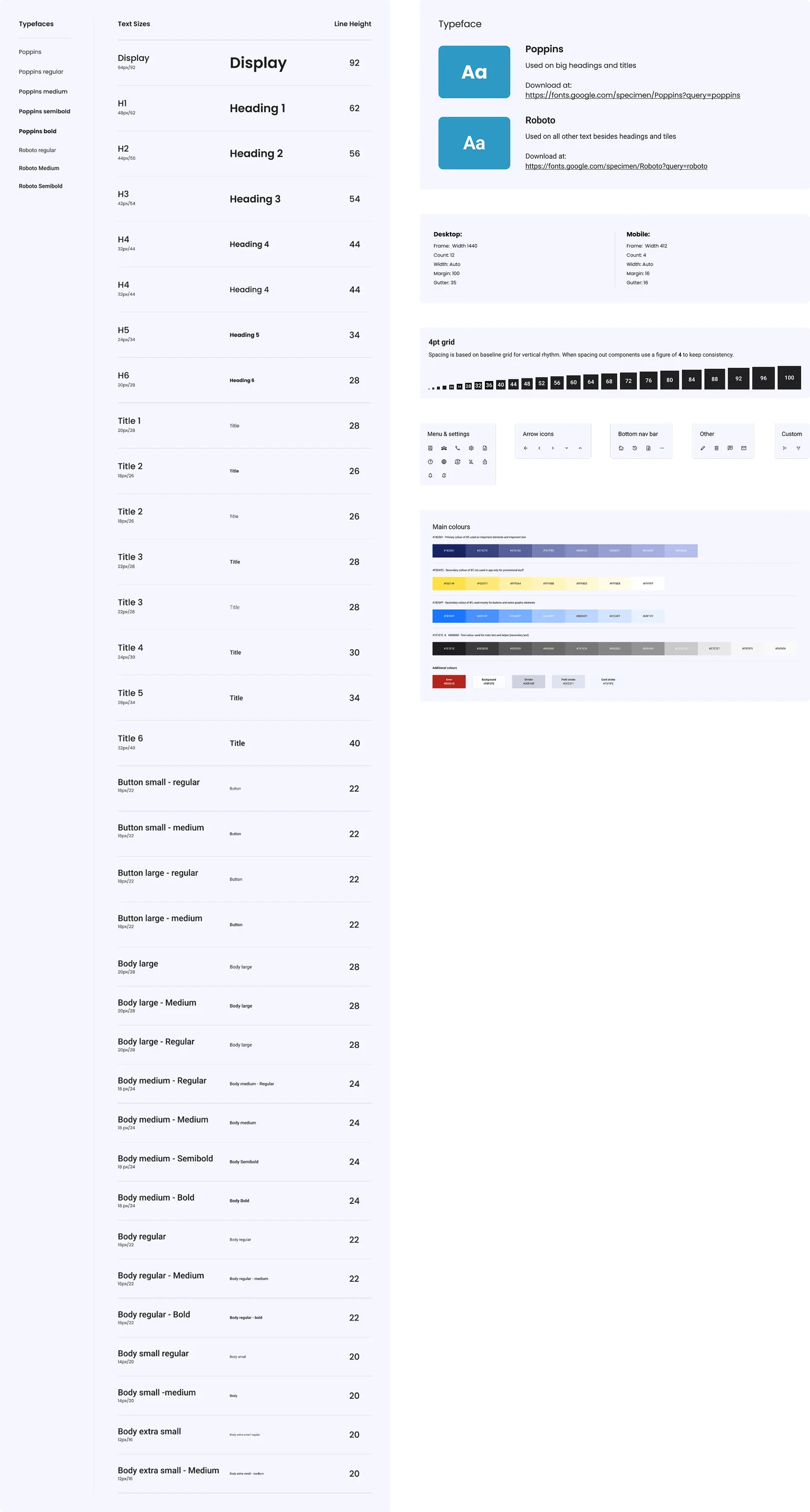
Research, IA, wireframes, UI, spec, handoff, in that order, with review cycles at every step. I led design for the whole website and the mobile apps; the team reviewed and refined with me.
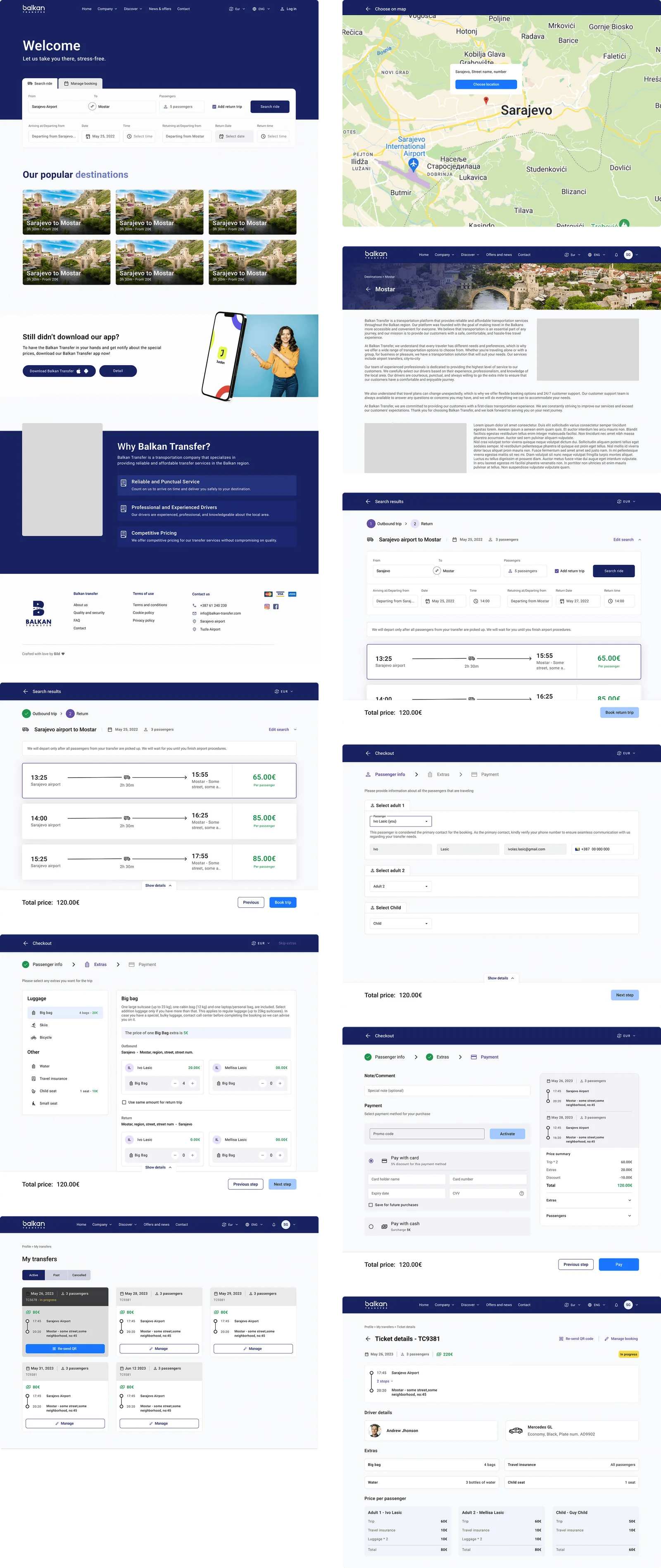
A few of the decisions inside the flow:
- 01Search and Manage booking share the first screen. Returning users go straight to their booking instead of hunting for a link in an email.
- 02Results show the price on every time slot, so choosing a time is also choosing a price.
- 03Passenger profiles are saved and reused. A regular picks the people they travel with; a first-timer types them once.
- 04Extras are configured in one place, per passenger, with the total updating as you go.
- 05The ticket is structured the same way for the customer and the driver: route, times, passengers, extras, price per passenger, and the driver and vehicle details before the ride.
05 // Where AI fit
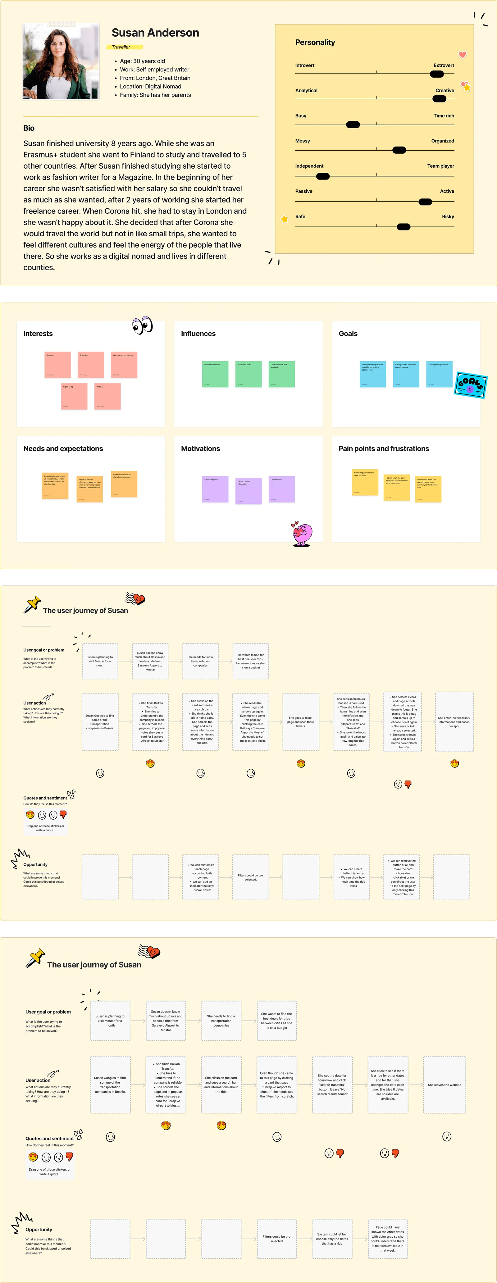
AI did the mechanical parts of research: synthesising the competitor audit, clustering pain points, scaffolding personas, and generating variants of UX copy for us to choose from. None of that is the design. What it bought was time, and I spent that time on the flow-level decisions and on feasibility conversations with engineering and the client, which is where a booking product is won or lost.
06 // Outcome
Shipped as V1:
- 01Full redesign of the public website
- 02Full design of the mobile apps
- 03Unified extras configuration
- 04Reusable passenger profiles
- 05Improved UX writing and system feedback
- 06Structured ticket information for drivers
- 07A My booking section for post-purchase management
- 08Driver and vehicle details visible before the ride
- 09Editing and cancelling bookings in the product, instead of by phone
What we expect it to change: fewer trial-and-error searches, less repeated data entry for returning users, clearer pricing, and fewer support calls for basic questions and small changes. Those are expectations, not measurements. Next time I'd ship the My booking section with its own analytics on day one, so the self-service claim has a number behind it.