← INDEX/06 OF 092022 – 2023
Cuckoo
Seven small decisions that made a wellbeing app usable.
Cuckoo is a workplace wellbeing app built around short breaks, challenges and groups. Recurring user feedback sessions turned into concrete changes: a two-word label fix that stopped people hunting for the break button, chip-based selection that took the memory load out of inviting friends, and a completion badge designed around sponsor logos we weren't allowed to cover.
- Role /
- Product Designer
- Team /
- Product, Engineering — Finland
- Timeline /
- 2022 – 2023
- Platform /
- Web app + mobile
- Tools /
- Figma
01 // How the work ran
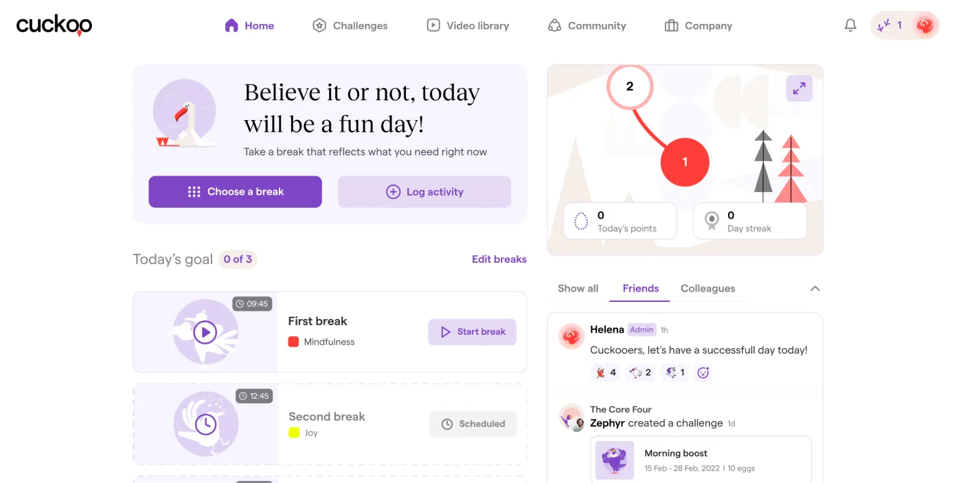
Cuckoo is a wellbeing app for the modern workplace: scheduled breaks with short videos, challenges you run with colleagues, and groups. I worked with product and engineering on usability and clarity. We ran recurring user feedback sessions; they set the priorities and surfaced the problems below, mostly around navigation, hierarchy and goal-setting.
None of these changes is big. That's the point. Each one removed a specific moment of confusion that feedback had named, and together they made progress easier to read, content easier to reach, and the product worth more to the people using it every day.
02 // Finding things: home and the video library
1. A two-word label
PROBLEM /
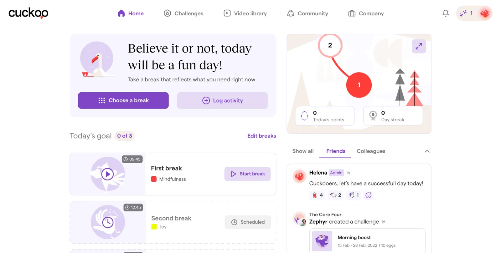
Users couldn't find how to take a break from the homepage. “Take a break” and “Start break” sat near each other, used the same icon, and meant different things.
DECISION /
Rename the homepage action to “Choose a break” and give it its own icon, so choosing and starting are visibly different verbs.
OUTCOME /
Feedback turned noticeably more positive, and people started breaks straight from the homepage instead of going through the video library to find one.
2. Filters you can see
PROBLEM /
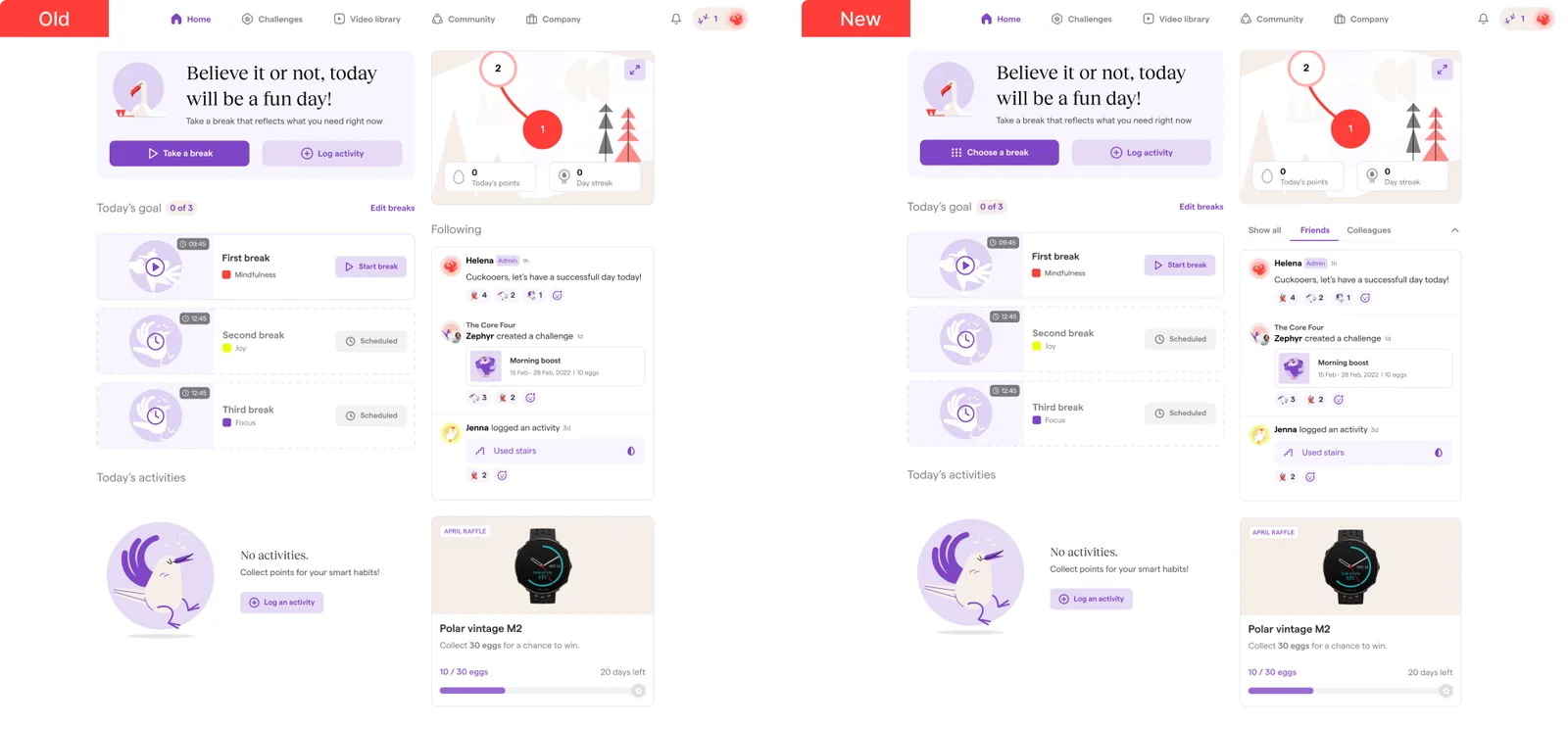
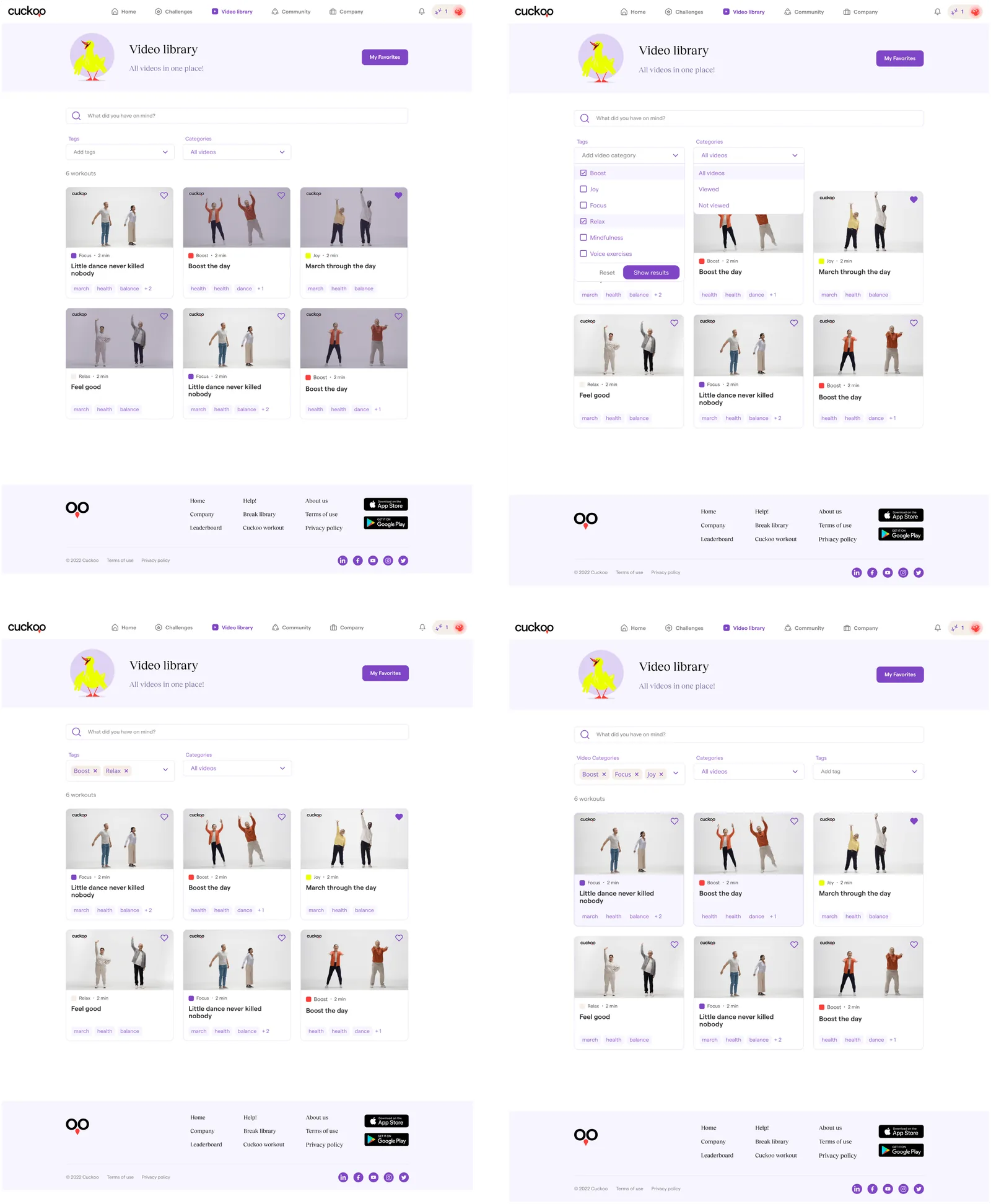
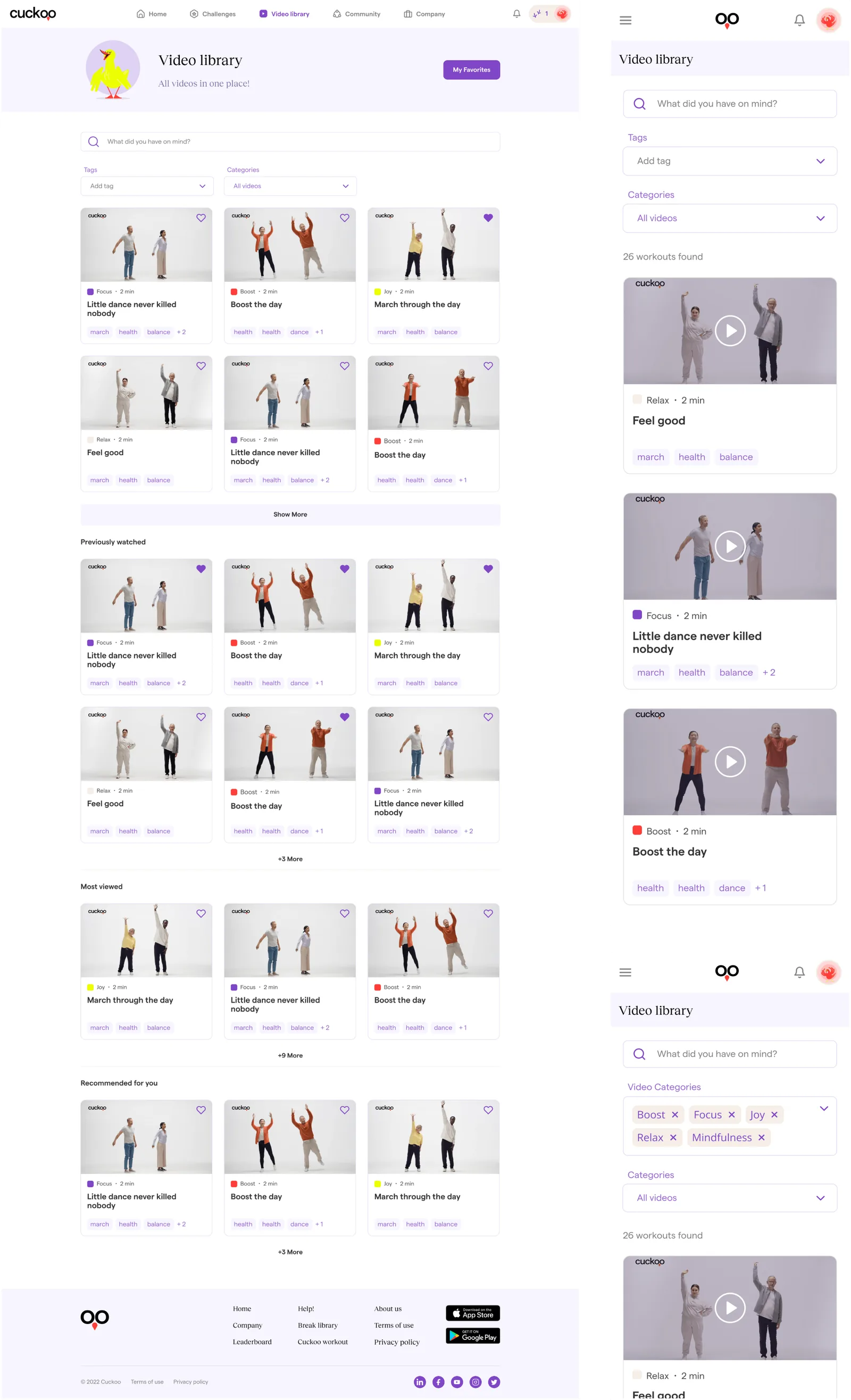
Browsing videos was slow. Two of the three filters overlapped, every thumbnail carried a play icon in a library that was nothing but videos, and once you confirmed your tags they disappeared, so removing one meant reopening the filter to find it.
DECISION /
Cut the redundant filter and keep Tags and Categories. Drop the play icon. Show selected tags as chips that can be removed inline.
OUTCOME /
Faster filtering and less visual noise. People could manage their tags without reopening menus.
3. Somewhere to go back to
PROBLEM /
No way to save a video, no history, and no personalised way in. Finding the right two-minute video meant filtering every time.
DECISION /
Add Favourites with a “My favourites” entry point, and three sections on the library page: Previously watched, Most viewed, Recommended for you.
OUTCOME /
Users can save a video, rewatch something familiar in one tap, and find new ones without touching a filter.
03 // Challenges: state, formats and sponsors
4. A badge that avoids the logo
PROBLEM /
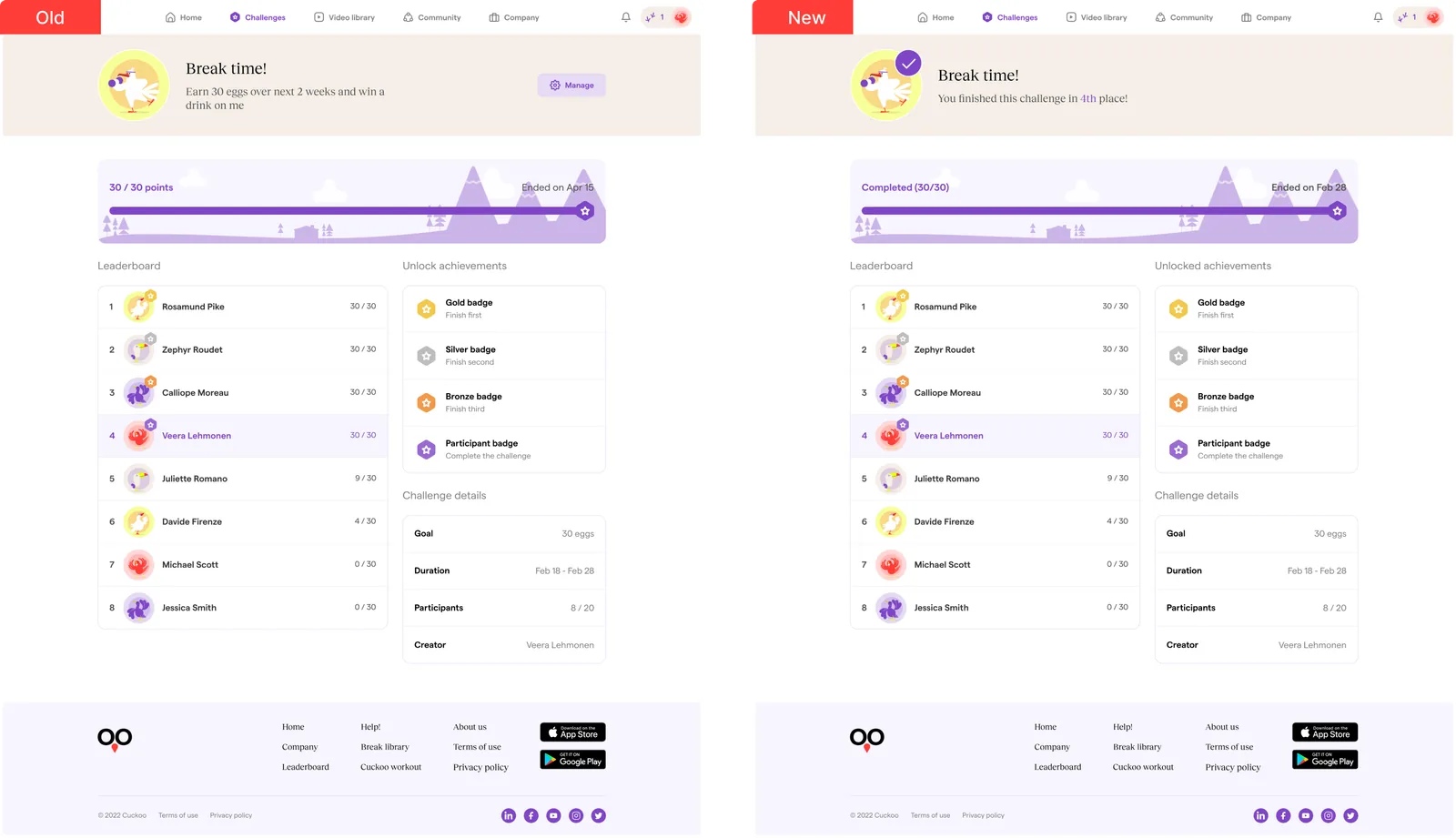
In the leaderboard view, people couldn't tell ongoing challenges from completed ones. Am I done? Should I join another? They opened detail pages just to find out.
CONSTRAINT /
Challenge avatars are sometimes sponsor logos, and we couldn't cover them. Visual complexity also had to stay minimal: the product serves a wide range of people, with more than forty working personas.
DECISION /
A purple tick in a circle, placed at the top-right edge of the avatar rather than centred on it. Visible, and clear of the logo.
OUTCOME /
State reads at a glance. Fewer detail pages opened just to check.
5. Three ways to compete
PROBLEM /
Interviews showed two kinds of people: some want self-paced personal goals, others are motivated by competition. And creating any challenge took so much coordination that many never got made.
DECISION /
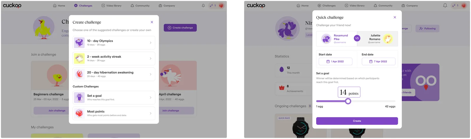
Two new formats and a shortcut. Most Points: competitive, ends when time runs out. Set a Goal: self-paced, ends when you hit your own target. Quick Challenge: one tap from a friend's profile, no group setup.
OUTCOME /
The formats map to different motivations: achievement, competition, autonomy, relatedness. We expected more challenges created, more friend-to-friend activity, and less drop-off at the setup step.
04 // Community: the feed and the invite
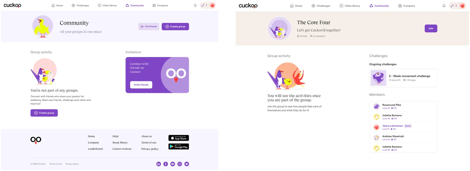
6. Activity, not groups
PROBLEM /
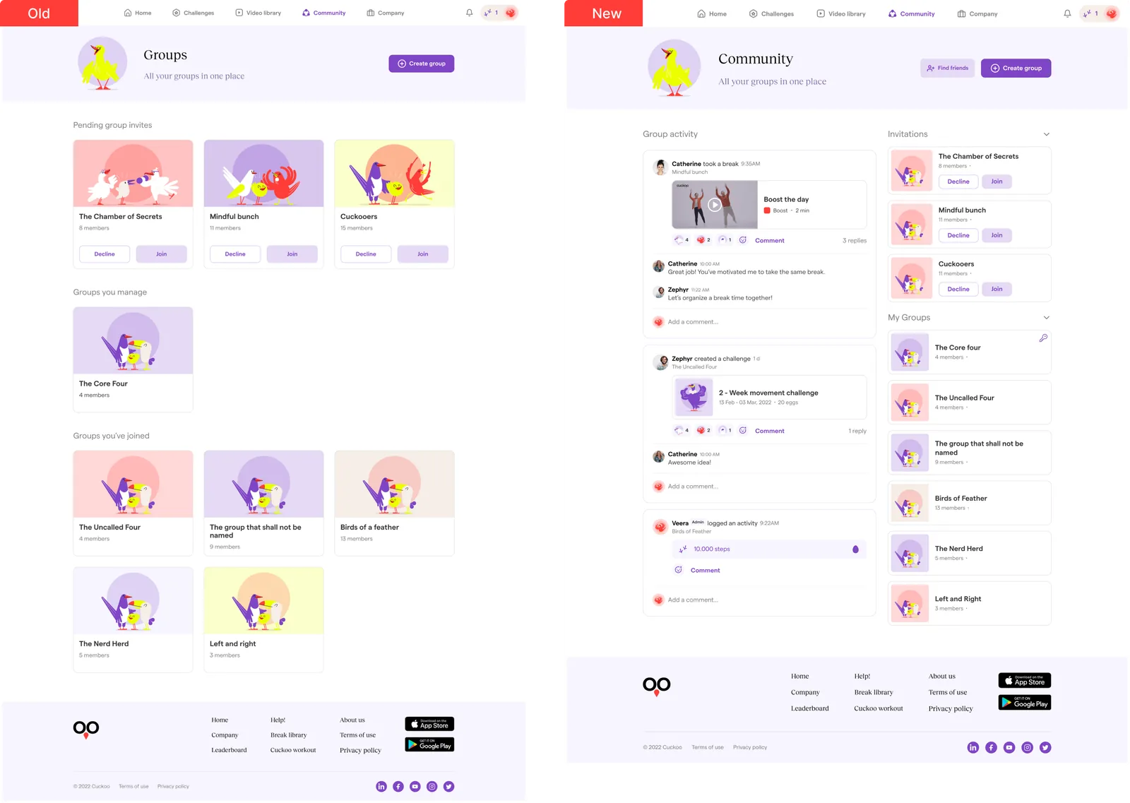
Participation lived inside each group page, so there was nowhere to see what was happening right now. People missed things and contributed less. Research put it plainly: users don't think in groups, they think in activity. They wanted to “see what others are doing without opening every group”.
CONSTRAINT /
Groups still had to exist. Invitations, membership and who manages what couldn't disappear into a feed.
DECISION /
One unified activity feed for posts, breaks and challenges across all groups. Each item labelled with its group for context. Invitations and My groups as collapsible side sections. A key icon on the groups the user manages.
OUTCOME /
Users see community activity at a glance and join in without drilling through layers.
7. Chips instead of checkboxes
PROBLEM /
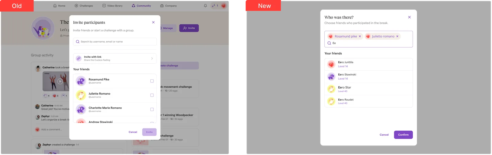
The Invite participants modal was a long checkbox list. Your selections scrolled out of view, so you had to remember who you'd already added. People got it wrong.
DECISION /
Reuse the chip-based selection pattern from the video library filters. Selected people appear as chips above the list, removable in one tap, with inline search for long lists.
OUTCOME /
Selection state is visible instead of memorised. Adding and removing participants got faster and surer, and the product gained one more place where the same pattern means the same thing.
What I'd do differently: most of these outcomes are qualitative, because that's what the feedback sessions produced. Next time I'd pair each change with one number before it ships — break starts from the homepage, how often a filter gets reopened, invites completed without an edit. Small decisions deserve small measurements, and the sessions would have had something to argue with.