← INDEX/09 OF 122024
Innos
A marketplace in three days, from a deliberately vague brief.
A German software company sent me a take-home: an in-app marketplace for business modules, from a thin Figma reference and requirements that were vague on purpose. I spent day one going the wrong direction, worked out that was the point, and rebuilt around one idea: recommend what complements what you already own. The Head of Design said it was the strongest submission they'd received.
- Role /
- Product Designer, solo
- Timeline /
- 3 days
- Platform /
- Web, in-app marketplace
- Tools /
- Figma, FigJam, GPT for the competitor list
01 // The brief
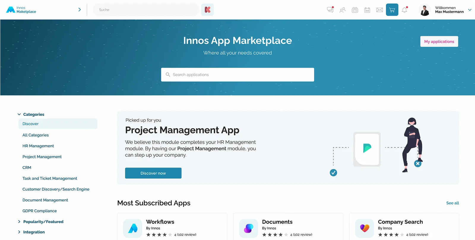
The company found me on LinkedIn and asked for a conceptual app subscription store: a low-friction marketplace inside their product, where a customer who already subscribes to one module discovers why they'd want another. I got a small Figma reference file, a loose set of requirements, free choice of which modules to use, and three days. The vagueness was deliberate. Dealing with it was the test.
- 3
- days, brief to submission
- 4
- competitors analysed
- 1
- idea the whole thing hangs on
02 // Day one: the wrong direction
I misread the brief and designed towards the wrong thing for most of a day. Then it clicked that the ambiguity wasn't an oversight, it was the assignment: could I scope a realistic solution from incomplete information, without waiting to be told? Read that way, the work got simple. Write down my interpretation, commit to it, and make it visible in the design so the reviewers could follow my reasoning even where they'd have chosen differently.
What I'd do differently is obvious in hindsight: write that interpretation down in the first hour, not at the end of the day. A sentence of assumptions costs nothing and would have bought me a day.
03 // Day two: four competitors, three colours
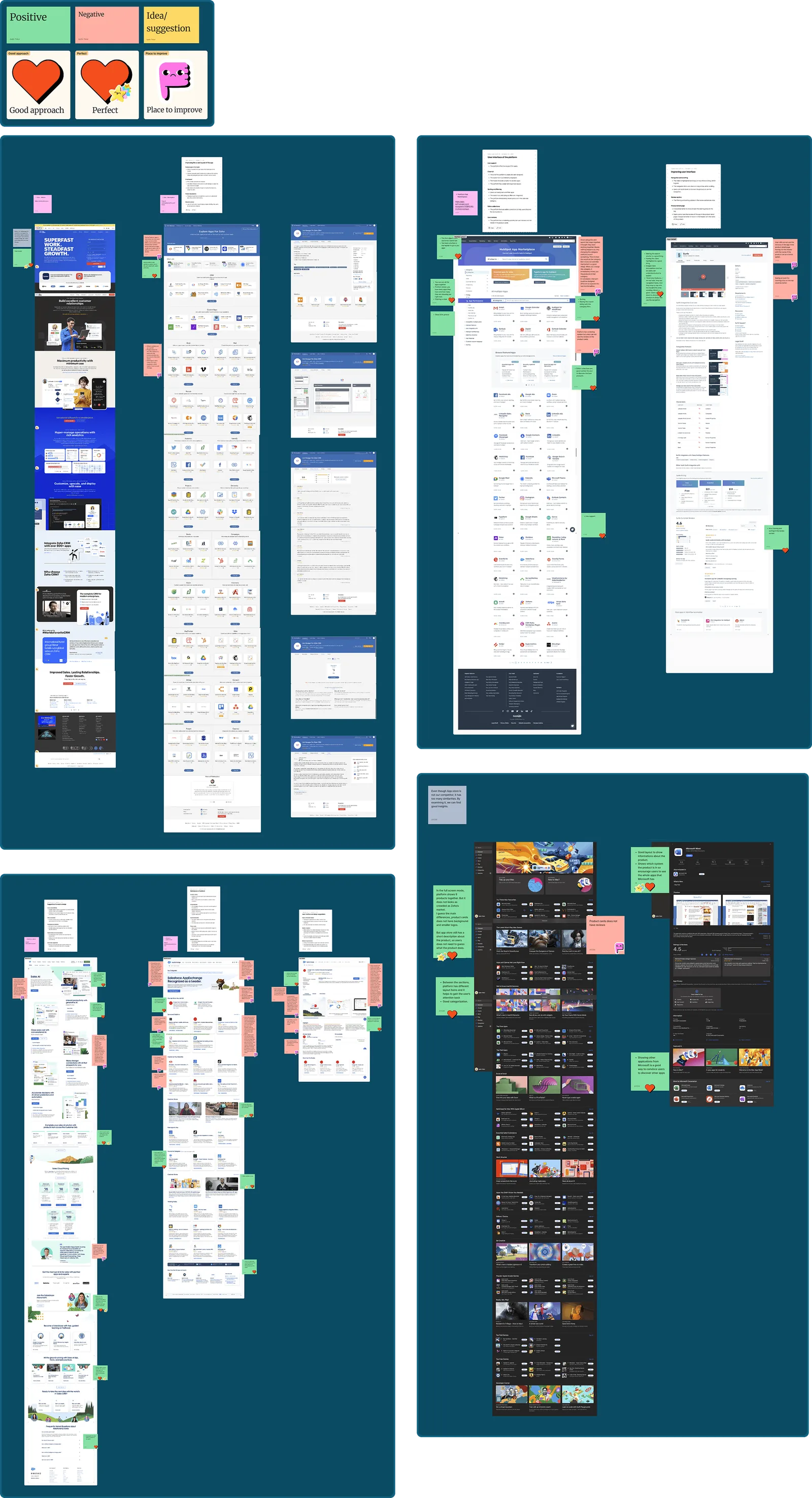
With the direction settled, I asked GPT for the most widely used marketplaces globally, picked four, direct and indirect, and went through their homepages and product detail pages. Screenshots went onto a FigJam board as I worked through the flows.
The board used three colours: green for strong UX decisions, red for pain points, yellow for ideas those patterns suggested for Innos. Stickers marked the moments that stood out either way. It's a simple system, and it works because it forces a verdict on every screenshot. By the end I had a working mental model of what a marketplace needs, and a list of what I wouldn't copy.
Then the first wireframe: the marketplace homepage.
04 // Day three: wireframes to UI
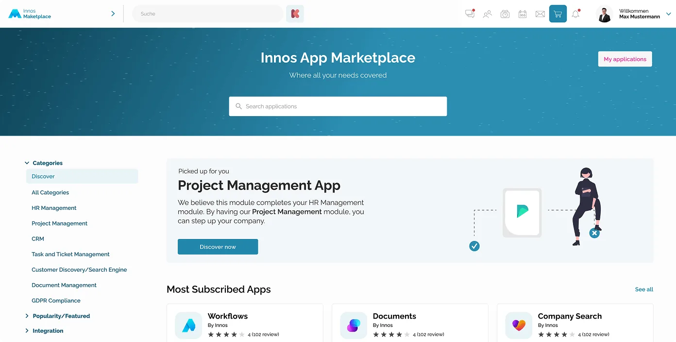
The homepage has to serve two people at once: someone who arrived with a product in mind, and someone who doesn't know what else exists. So the search bar sits at the top, where task-driven users expect it, but stays compact to leave room for discovery. A persistent filter navigation on the left lets people browse by category or function, and keeps working as the catalogue grows. The default tab is Discover, which is where curated, lesser-known modules get their exposure.
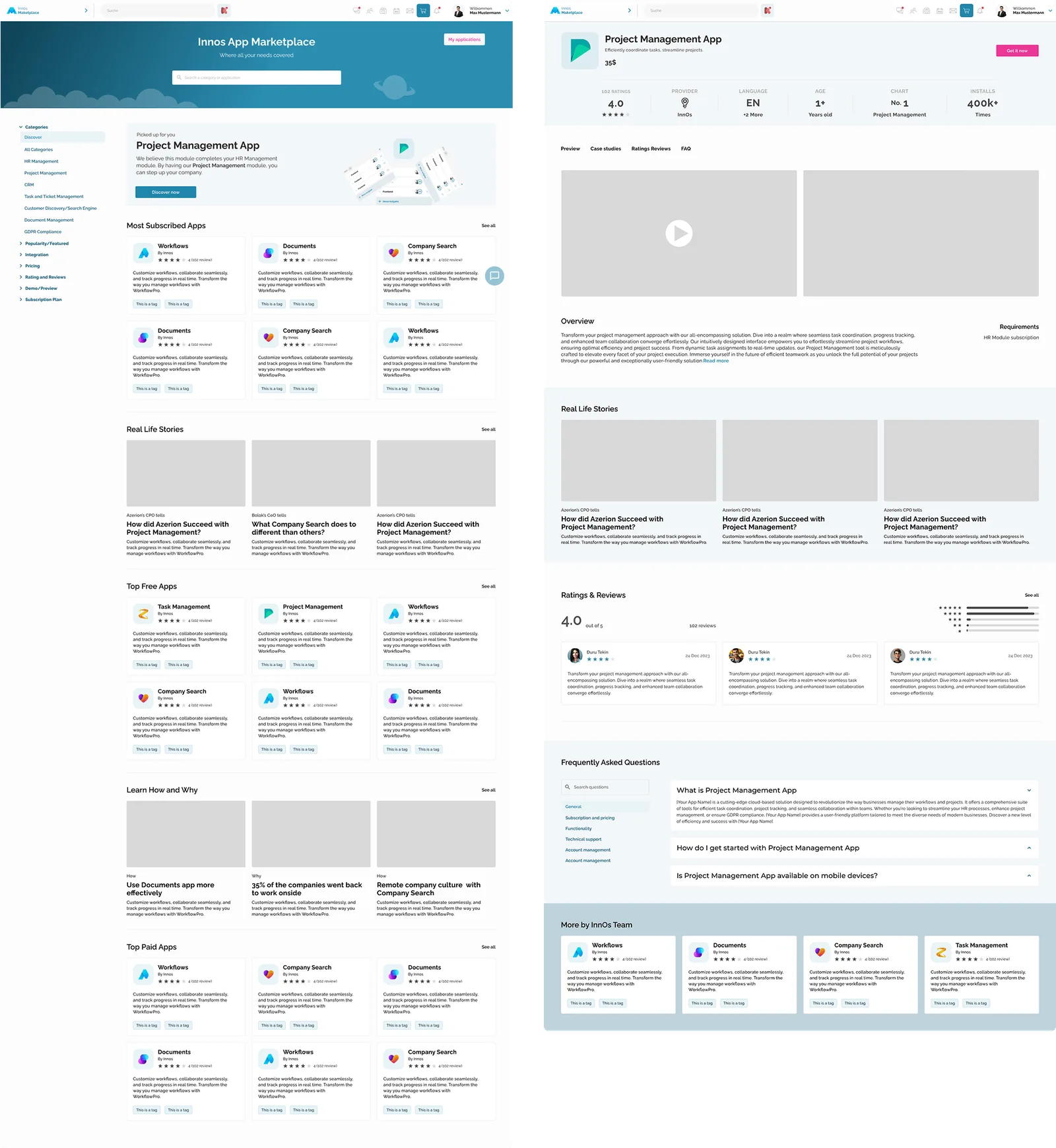
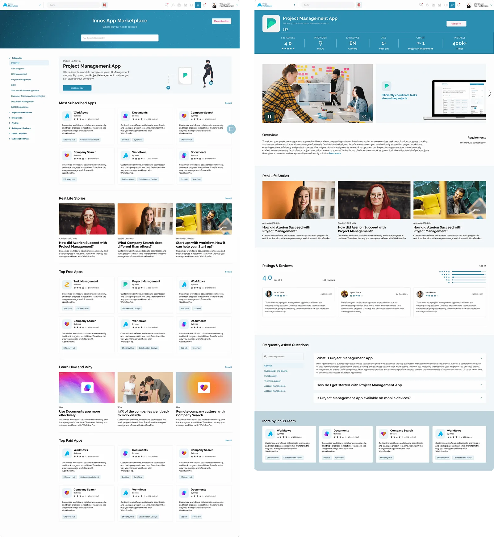
The decision the whole submission hangs on is the “Picked for You” section. It recommends a module that complements what the user already subscribes to. In the test case the user has HR Management; the interface suggests Project Management with one line of copy: “We believe this module complements your HR Management setup. By adding Project Management, you can take team efficiency and goal-tracking to the next level.” That turns a catalogue into an upgrade path, and it answers the brief's actual question, how someone discovers the value of a second module, in a single card.
- 01Top Paid Apps and Most Subscribed: social proof.
- 02Learn How and Why: short content on getting more out of a module.
- 03Real Life Stories: real professionals on what changed for their business.
- 04On the product detail page: Real Life Stories again, and a More from this Creator module at the bottom for the cross-sell.
For the UI I stayed inside the design system the reference file implied, reusing its components wherever they existed and matching spacing, corner radius, iconography and type for the ones I had to make. The palette is cool blue, which reads as professional and slightly cold. I warmed it through the imagery instead of the interface: the photos on product cards and stories share oranges, yellows, greens and warm light. Cool UI, warm pictures. Structured, but human.
05 // Outcome
I submitted the full project inside the three days. The Head of Design later told me it was the best case study submission they had received.
What it sharpened: working through ambiguity without stalling, scoping something realistic fast, and holding focus under a deadline. What I'd push further now is the recommendation itself. “Picked for You” is a card; the interesting work is the rule behind it, which modules complement which, and on what evidence. I'd sketch that rule next to the card, so the idea survives its first conversation with an engineer.